Skip to content
ServiceDig
Coffee Machines
Gaming
Video Games
Video Game Controllers
Headphones & Earbuds
Earbud Headphones
Headsets
Open-Ear Headphones
Over-Ear Headphones
Home Security
Cameras
Doorbells
Home Security Systems
Speakers
Bookshelf Speakers
Portable Bluetooth Speakers
Sound Bars
Smart Home
Smart Locks
Smart Thermostats
Vacuums
Carpet Cleaning Machines
Handheld Vacuums
Robotic Vacuums
Shop Wet Dry Vacuums
Stick Vacuums & Electric Brooms
Upright Vacuums
Search
ServiceDig
Attributes
Smart Watch
user interface
user interface
Best
Smart Watch
#1
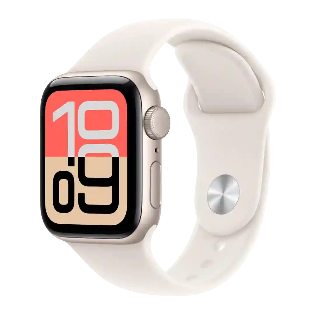
Apple Watch SE 3
The overall interface is seen as fluid, cohesive, and well thought out, making everyday tasks straightforward even on the smaller display.
#2
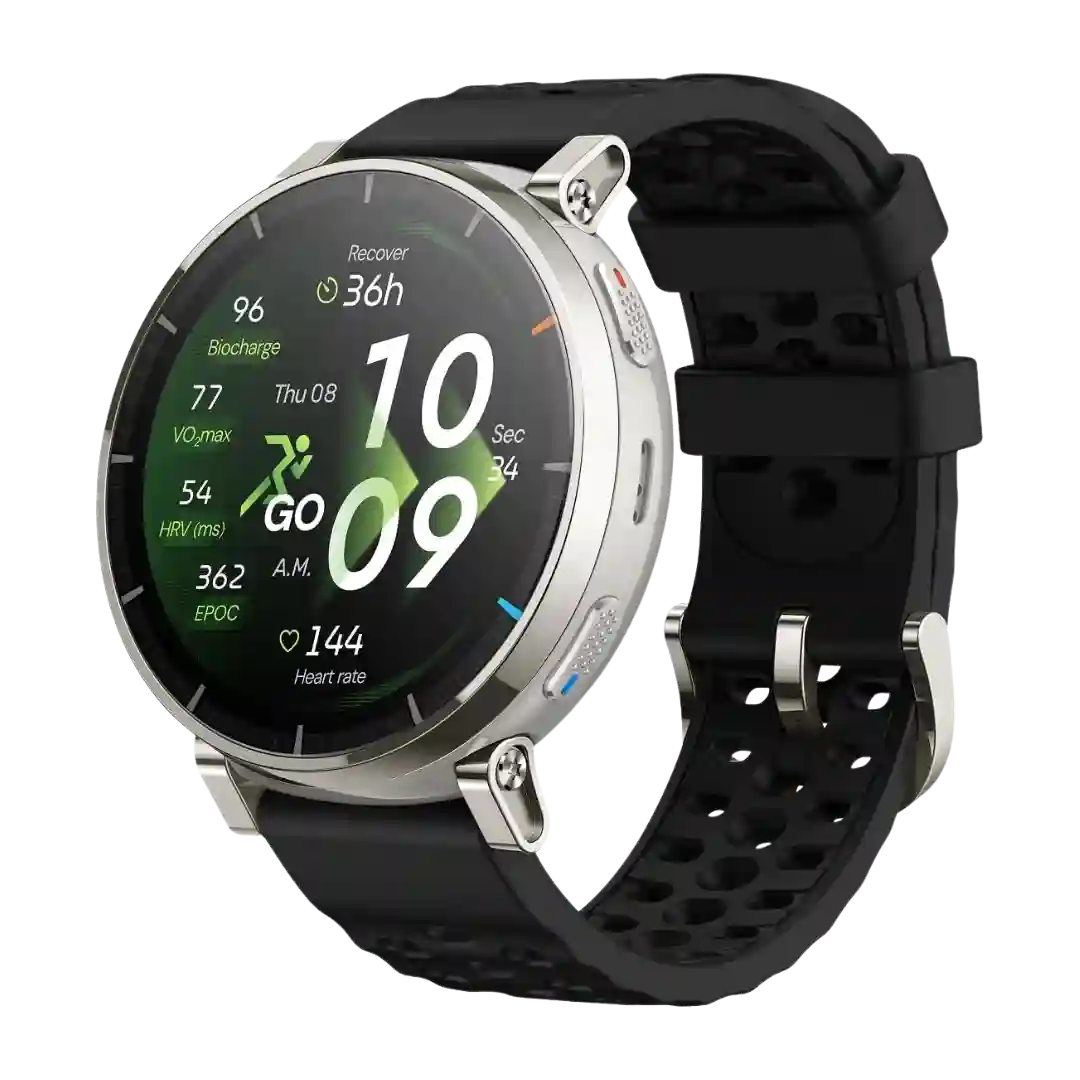
Amazfit Active 3 Premium
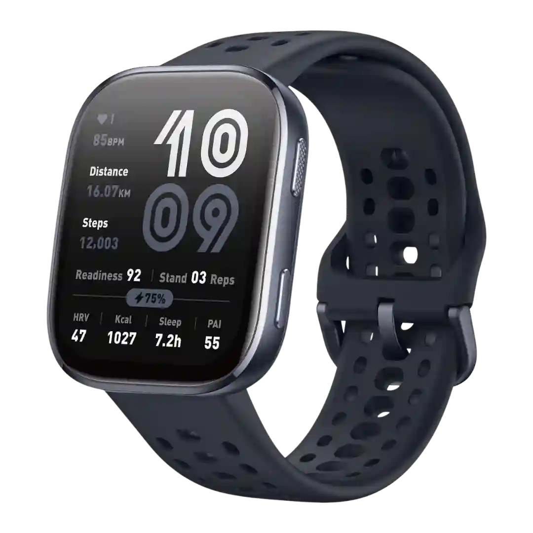
The user interface is generally described as clear, self-explanatory, and practical for beginners.
#3
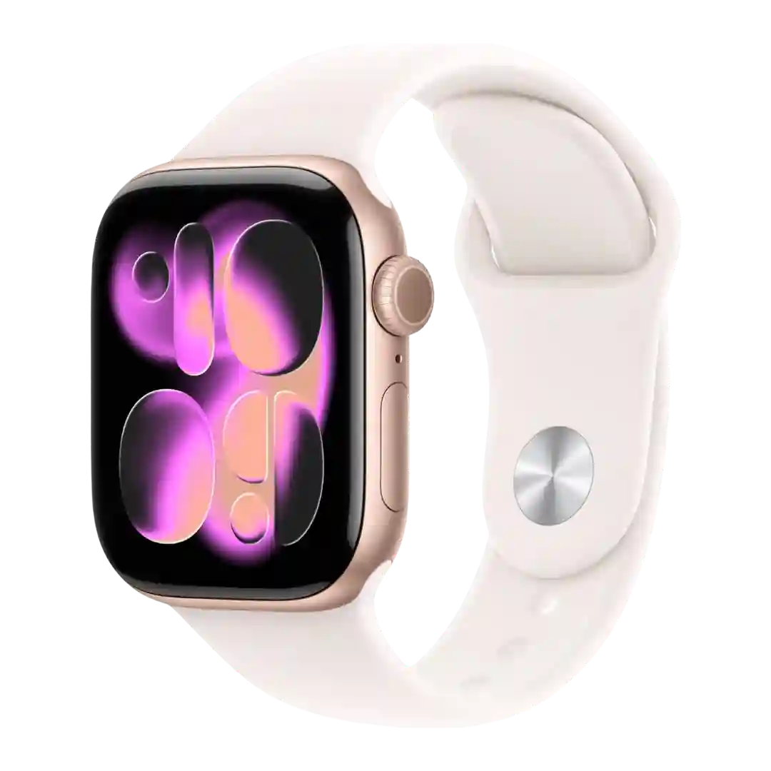
Apple Watch Series 11
The interface is praised for being clean and attractive, while larger buttons improve everyday usability.
#4
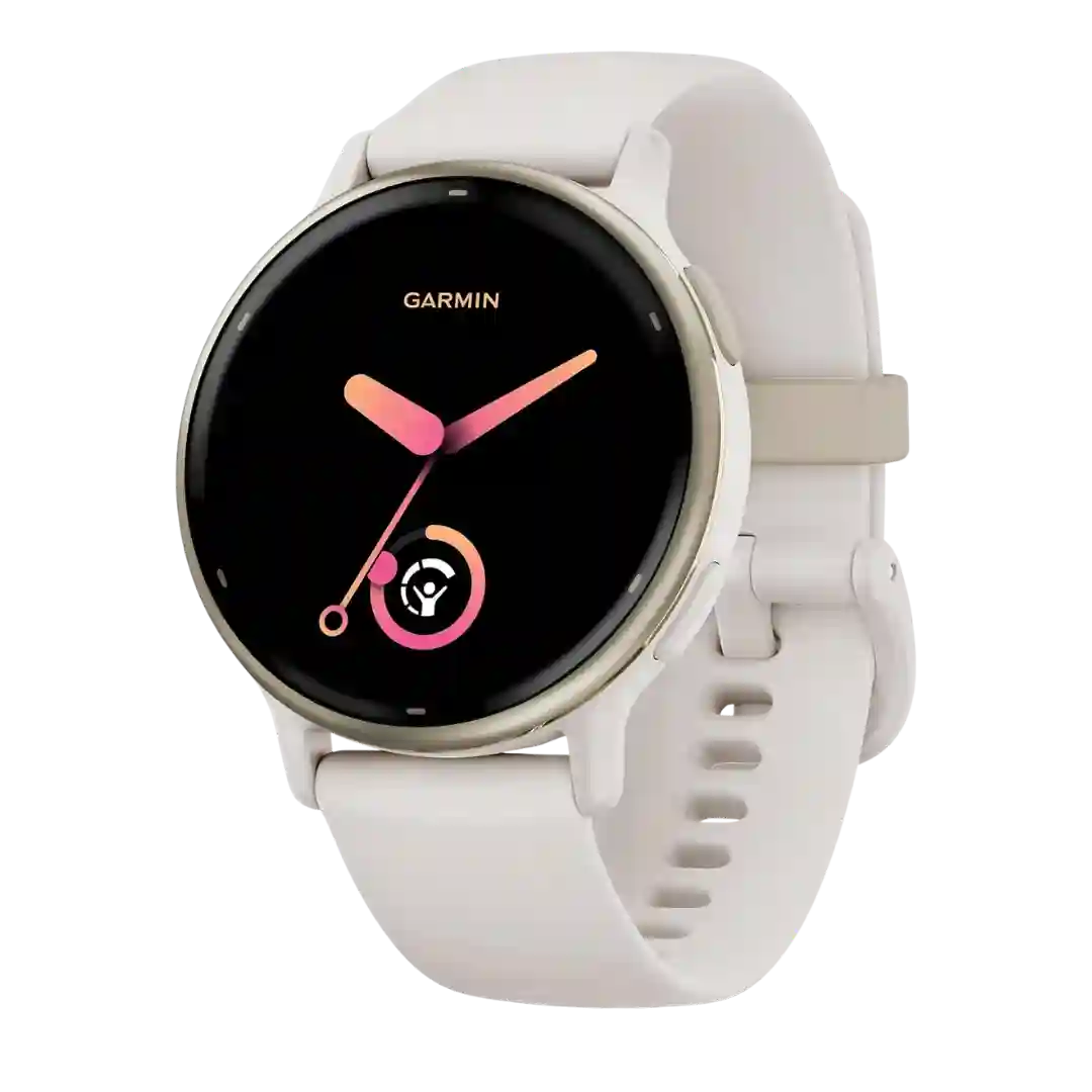
Garmin Vivoactive 5
The user interface is improved and easier to navigate than older Garmin efforts, but still not fully intuitive for everyone.
#5
Amazfit Bip 6
The UI gets the job done, but it is one of the main tradeoffs versus pricier watches because it can feel clunky or overcomplicated.