Best for HUD clarity
Hyrule Warriors: Age of Imprisonment
4.7 feature score
Highest scored product for this feature based on supporting review evidence.
Highest scored product for this feature based on supporting review evidence.
Balances feature score, supporting reviews, and overall product strength.
Has the broadest review evidence for this feature.
Strongest overall product among items with scored evidence for this feature.
Showing Nintendo only. Switch back to all brands anytime.
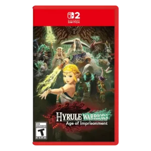
HUD clarity was praised through clear prompts and on-screen guidance, though broader tutorial flow could feel dense.
Pros: animation quality, multiplayer design
Cons: save system reliability, companion AI
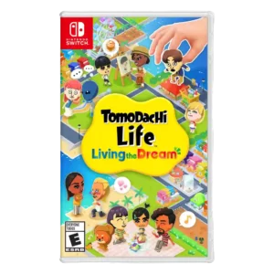
One review highlights the relationship chart as a helpful on-screen aid for understanding nearby Mii connections.
Pros: grind level, originality
Cons: social features, accessibility options
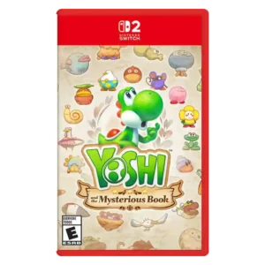
Optional exploration tools can expose useful information and help track secrets, with flexible placement on screen. They arrive late and can make the display feel cluttered if too many are...
Pros: platforming precision, protagonist appeal
Cons: pacing, co-op experience
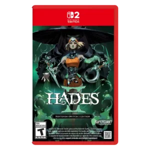
Readability is the main HUD concern, especially portable mode and late-game effect clutter that can make action hard to parse.
Pros: skill tree depth, dialogue quality
Cons: emotional impact, economy and resource balance
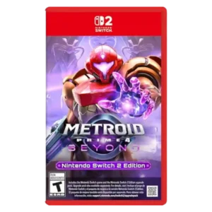
One review found scan-log clarity weakened by indistinct highlighting, making completion tracking more of a hassle than it needed to be.
Pros: world-building, frame rate stability
Cons: companion AI, upgrade system
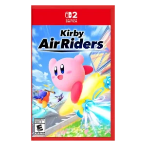
Visual readability drew criticism when chaos, spectacle, and cramped action made information hard to parse.
Pros: flying mechanics, exploration quality
Cons: AI behavior, boss design
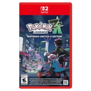
HUD clarity was criticized because battle information and feedback could move too fast or be hard to read.
Pros: crash stability, gameplay mechanics
Cons: AI behavior, monetization fairness