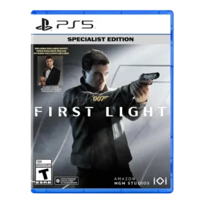
User interface design has limited but very positive evidence around Bond's watch integrating onscreen information cleanly.
Pros: level design, user interface design
Cons: AI behavior, facial animations
User interface design has limited but very positive evidence around Bond's watch integrating onscreen information cleanly.
Pros: level design, user interface design
Cons: AI behavior, facial animations
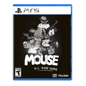
The clean interface keeps objectives and navigation visible without crowding the screen. Its animated elements support the cartoon style while remaining functional.
Pros: lore depth, user interface design
Cons: AI behavior, aiming precision
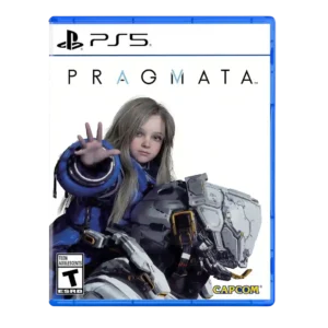
User interface design is praised for streamlined menus and real-time information that reduces friction.
Pros: bug frequency, user interface design
Cons: HUD clarity, mission design
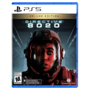
The interface around branching timelines was praised as satisfying for completionists and less repetitive than full replays.
Pros: user interface design, graphics quality
Cons: combat system, animation quality
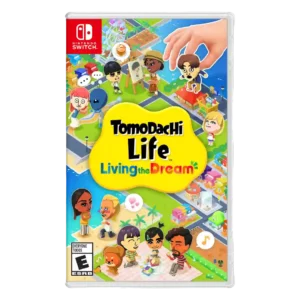
The interface and building tools are repeatedly praised as clean, intuitive, snappy, and easy to use.
Pros: grind level, originality
Cons: social features, accessibility options
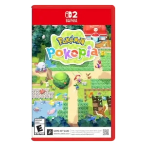
User interface design was praised for clarity, cleanliness, and a more seamless feel than many cozy sims.
Pros: protagonist appeal, faithfulness to franchise
Cons: map and navigation design, aiming precision

The interface is generally praised for being clean, minimal, and easy to read, keeping loadouts and combat information understandable without clutter.
Pros: gameplay mechanics, boss design
Cons: age appropriateness, family friendliness
User interface design is praised for restraint, especially the absence of intrusive button prompts.
Pros: onboarding experience, environmental detail
Cons: family friendliness, movement feel
The UI is praised for matching the comic-book aesthetic alongside backgrounds and character models.
Pros: emotional impact, frame rate stability
Cons: server reliability, tutorial quality
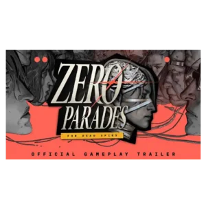
The interface is stylish, tactile, and generally clear despite the game’s complexity. Minor tracking and navigation frustrations keep it from being flawless.
Pros: level design, world interactivity
Cons: performance optimization, menu usability
The interface-related focus mode was praised as useful for clue reading and efficient investigation.
Pros: core gameplay loop, replay value
Cons: value for money, difficulty balance

User interface design gets limited positive evidence from cinematic UI removal during autodrive.
Pros: open-world design, replay value
Cons: dialogue quality, writing quality
The user interface design was positively received for feeling familiar to the anime.
Pros: environmental detail, art direction
Cons: world interactivity, loot system
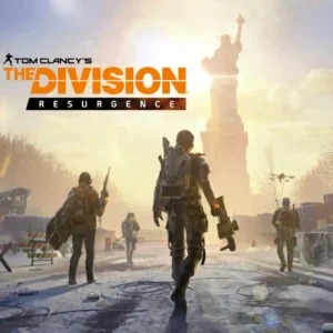
Customizable touch layouts are strong, but dense menus, small-screen crowding, and layered systems often undermine usability.
Pros: exploration quality, sandbox freedom
Cons: mission variety, companion AI
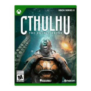
UI evidence was split between praise for The Vault and clean interface and complaints about text size or clumsy controls.
Pros: world-building, world interactivity
Cons: enemy variety, stealth mechanics
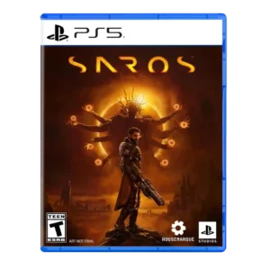
User interface design had limited mixed evidence, with one reviewer finding it good enough but imperfect.
Pros: value for money, fun factor
Cons: map and navigation design, side character depth
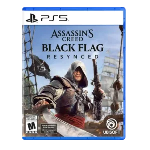
User interface design has a mixed note because one reviewer found the on-screen combat UI somewhat messy despite being understandable.
Pros: core gameplay loop, visual effects quality
Cons: monetization fairness, microtransaction impact
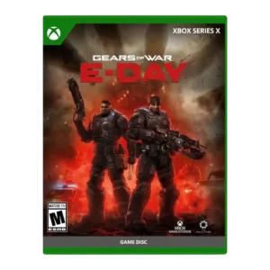
Interface design is mixed because one reviewer dislikes the centered active reload presentation, even though customization is discussed elsewhere.
Pros: emotional impact, art direction
Cons: value for money, platform-specific feature support

User interface design was mixed: one review found it organized and another effective, but several criticized parsing, hotspot cycling, and rough interface elements.
Pros: accessibility options, protagonist appeal
Cons: frame rate stability, polish
The interface is serviceable, but persistent HUD elements and a few menu choices can feel visually intrusive in such an atmosphere-driven game.
Pros: writing quality, checkpoint system
Cons: bug frequency, HUD clarity
User interface design was mixed, with map/UI glitches and requests for clearer map information.
Pros: crash stability, HUD clarity
Cons: character development, visual effects quality
UI drew repeated criticism for quirks, objective clarity, and missing convenience such as auto-loot.
Pros: art direction, environmental detail
Cons: multiplayer design, accessibility options
Interface design is a regular drawback, especially with maps, menus, and navigation that feel awkward for a game this large.
Pros: puzzle design, sound design
Cons: accessibility options, AI behavior

UI design is a repeated weakness, with overlap, clutter, cumbersome potential screens, and unreadable bugged menus mentioned.
Pros: movement feel, skill tree depth
Cons: menu usability, HUD clarity
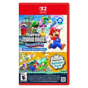
Bellabel Park’s presentation can become visually cluttered, and at least two writers find the mode organization confusing. The underlying activities are fun, but the interface does not always make them...
Pros: controls responsiveness, voice acting
Cons: matchmaking quality, user interface design
Reviewer evidence is negative or mixed: user interface design was often criticized, even where some reviewers found redeeming moments across 1 review(s).
Pros: level design, replay value
Cons: stealth mechanics, save system reliability
User interface design drew negative evidence for a noisy, cluttered UI with too many systems.
Pros: facial animations, polish
Cons: grind level, stealth mechanics
Interface complaints focus on overlapping subtitles, awkward presentation, and other rough UI details that do not match the cinematic ambitions of the rest of the game.
Pros: visual effects quality, horror tension
Cons: aiming precision, stealth mechanics
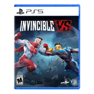
User interface design drew a strong negative score from a tutorial complaint about missing button prompts.
Pros: immersion, frame rate stability
Cons: user interface design, bug frequency
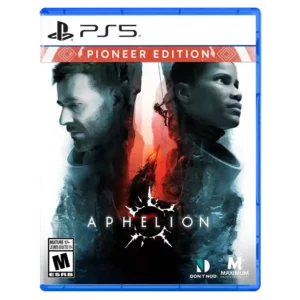
Delayed prompts and interactions can make the interface feel unresponsive, particularly when the game waits for dialogue or animations to finish.
Pros: HUD clarity, onboarding experience
Cons: user interface design, menu usability