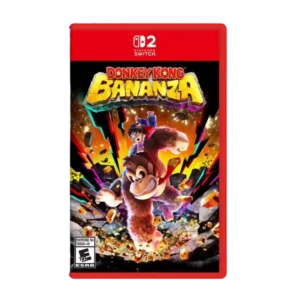
User interface design was praised for the helpful layer checklist that makes collectible tracking easier.
Pros: gameplay mechanics, world interactivity
Cons: economy and resource balance, enemy variety
User interface design was praised for the helpful layer checklist that makes collectible tracking easier.
Pros: gameplay mechanics, world interactivity
Cons: economy and resource balance, enemy variety
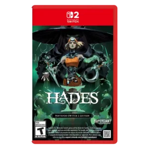
The interface receives praise for carrying the art direction into menus and buttons, putting Supergiant near the top of UI craft.
Pros: skill tree depth, dialogue quality
Cons: emotional impact, economy and resource balance
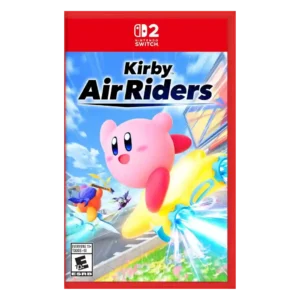
One reviewer praised the presentation, menus, UI, unlocks, sound, and graphics as beautiful.
Pros: flying mechanics, exploration quality
Cons: AI behavior, boss design
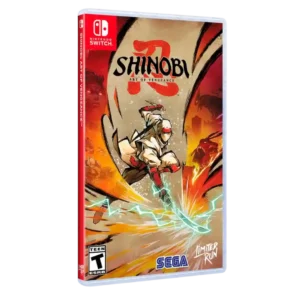
User interface design receives praise for being clean and easy to navigate.
Pros: graphics quality, environmental detail
Cons: bug frequency, dialogue quality
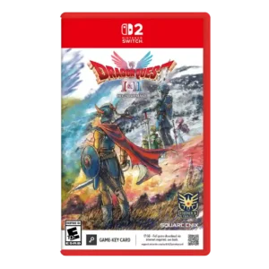
Interface changes, shortcut assignments, and UI overhaul were praised for making these old games easier to play.
Pros: visual effects quality, environmental detail
Cons: AI behavior, level design
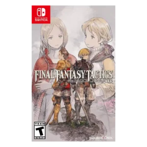
User interface design was one of the clearest improvements, bringing more information forward and modernizing menus.
Pros: emotional impact, polish
Cons: bug frequency, crash stability
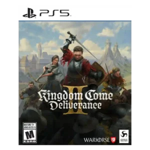
UI feedback was positive when reviewers discussed improved, adaptable, or visually polished interface presentation.
Pros: soundtrack quality, fun factor
Cons: checkpoint system, family friendliness
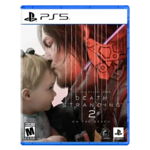
User interface design is praised for thoughtful fictional UI and a radial menu that makes road management easier.
Pros: animation quality, facial animations
Cons: quest design, AI behavior
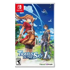
User interface design was praised for easy navigation and a modern UI, though evidence was limited.
Pros: protagonist appeal, art direction
Cons: camera behavior, tutorial quality
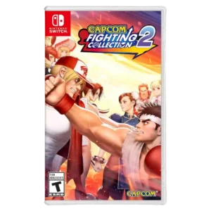
The user interface is praised as sleek and easy to enter from the outset.
Pros: emotional impact, sound design
Cons: cross-play support, boss design
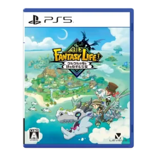
The customization interface is praised for letting players place and manage island objects quickly and efficiently.
Pros: load times, crash stability
Cons: originality, voice acting
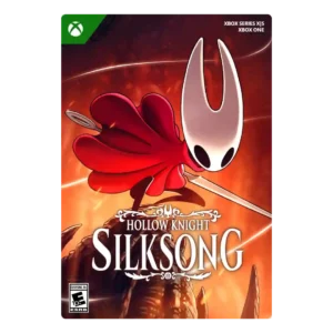
User interface design has limited positive evidence around attractive mission HUD illustrations and attention to detail.
Pros: core gameplay loop, world interactivity
Cons: loot system, accessibility options
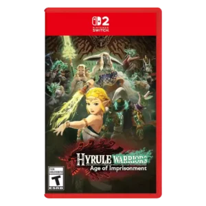
User interface design was mixed, with praise for faithful Zelda-style menus but other reviews criticizing map/interface clutter.
Pros: animation quality, multiplayer design
Cons: save system reliability, companion AI
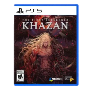
User interface design earns praise for an encyclopedia that explains abilities and systems.
Pros: core gameplay loop, controls responsiveness
Cons: mission design, learning curve

User interface design was praised for simple navigation and a fitting aesthetic touch.
Pros: atmosphere, voice acting
Cons: world interactivity, camera behavior
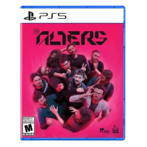
UI design was mostly praised as clean, tactile, and not intrusive, with some interface quirks noted.
Pros: controls responsiveness, onboarding experience
Cons: crash stability, grind level
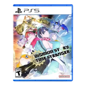
UI design was polarized: some reviewers called it clean and easy, while another strongly criticized clutter and constant pop-ups.
Pros: atmosphere, world-building
Cons: HUD clarity, fast travel convenience
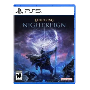
User interface design was considered streamlined in inventory and improved through later UI updates.
Pros: emotional impact, visual effects quality
Cons: crash stability, cross-play support
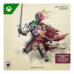
UI options such as text sizing and subtitles were appreciated as useful interface support.
Pros: tutorial quality, level design
Cons: stealth mechanics, endgame content
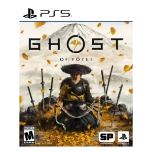
UI evidence is mixed: restrained maps and menus are praised, but one reviewer reports low-contrast text and hard-to-see map elements.
Pros: movement feel, environmental detail
Cons: puzzle design, age appropriateness
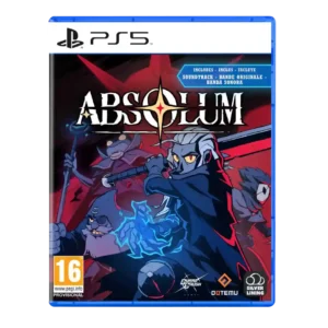
User interface design was mostly fine but received a handheld-specific caveat around small text and lack of font scaling.
Pros: mission design, world interactivity
Cons: quest design, endgame content
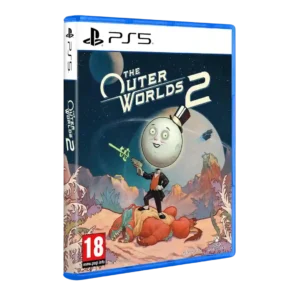
Interface design was split between a UI that stayed out of the way and a cluttered UI complaint.
Pros: world-building, mission design
Cons: mission variety, enemy variety
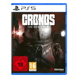
User interface and inventory usability drew mixed evidence, with some one-button convenience but repeated irritation around inventory management and reloading.
Pros: core gameplay loop, emotional impact
Cons: checkpoint system, bug frequency
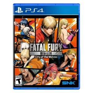
User interface design is divisive: some like the comic-book styling, while others criticize small text, weak UI, or barebones menus.
Pros: emotional impact, animation quality
Cons: enemy variety, server reliability
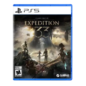
The user interface drew criticism for clutter and painful Picto/menu navigation despite stylish presentation.
Pros: monetization fairness, microtransaction impact
Cons: platforming precision, menu usability
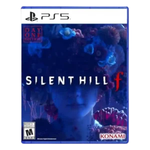
User interface design was split between praise for the journal’s care and criticism of poor organization in notes and collectibles.
Pros: voice acting, emotional impact
Cons: family friendliness, menu usability
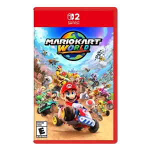
User interface design was mixed-to-negative, with complaints about missed music selection and underdeveloped online feature presentation.
Pros: animation quality, sound design
Cons: difficulty balance, AI behavior
Inventory UI was criticized for lacking search and customization even though basic grouping exists.
Pros: frame rate stability, platform-specific feature support
Cons: voice acting, writing quality
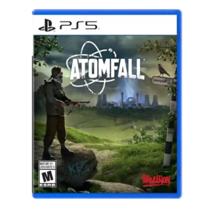
User interface design had limited negative evidence, with one reviewer saying full-screen menus broke immersion.
Pros: art direction, frame rate stability
Cons: boss design, camera behavior
User interface design is one of the clearest pain points, criticized as poorly conceived, flat, slow, or a step backward despite one positive UI comparison note.
Pros: sandbox freedom, art direction
Cons: polish, save system reliability
Interface clarity was criticized where the game's visual language made interactable options or progress less obvious.
Pros: writing quality, checkpoint system
Cons: menu usability, user interface design
UI design was a common complaint, especially streaming-app-style menus and loadout screens.
Pros: haptic feedback integration, performance optimization
Cons: pacing, microtransaction impact
User interface design had a negative console/set-piece example where cursor text highlighting bogged down the experience.
Pros: side character depth, visual effects quality
Cons: user interface design, handheld play suitability
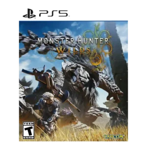
User interface design was criticized where radial menus felt unresponsive and UI friction recurred during repeated hunt cycles.
Pros: art direction, cross-play support
Cons: dialogue quality, monetization fairness
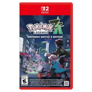
User interface design drew criticism where feedback during combat was hard to parse.
Pros: crash stability, gameplay mechanics
Cons: AI behavior, monetization fairness
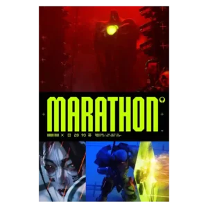
The interface is the most consistent criticism. Menus, inventory icons, loot management, and information density are stylish but frequently described as cluttered, confusing, or unnecessarily hard to use.
Pros: world interactivity, voice acting
Cons: menu usability, HUD clarity
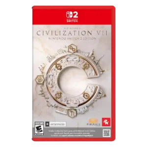
The user interface was the most repeated complaint, often described as inadequate, ugly, missing information, or confusing even when later improved.
Pros: animation quality, controls responsiveness
Cons: matchmaking quality, user interface design