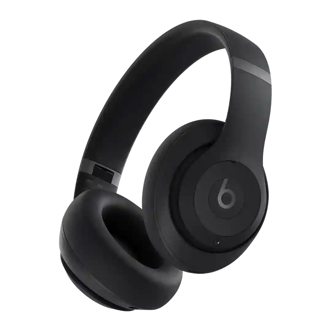
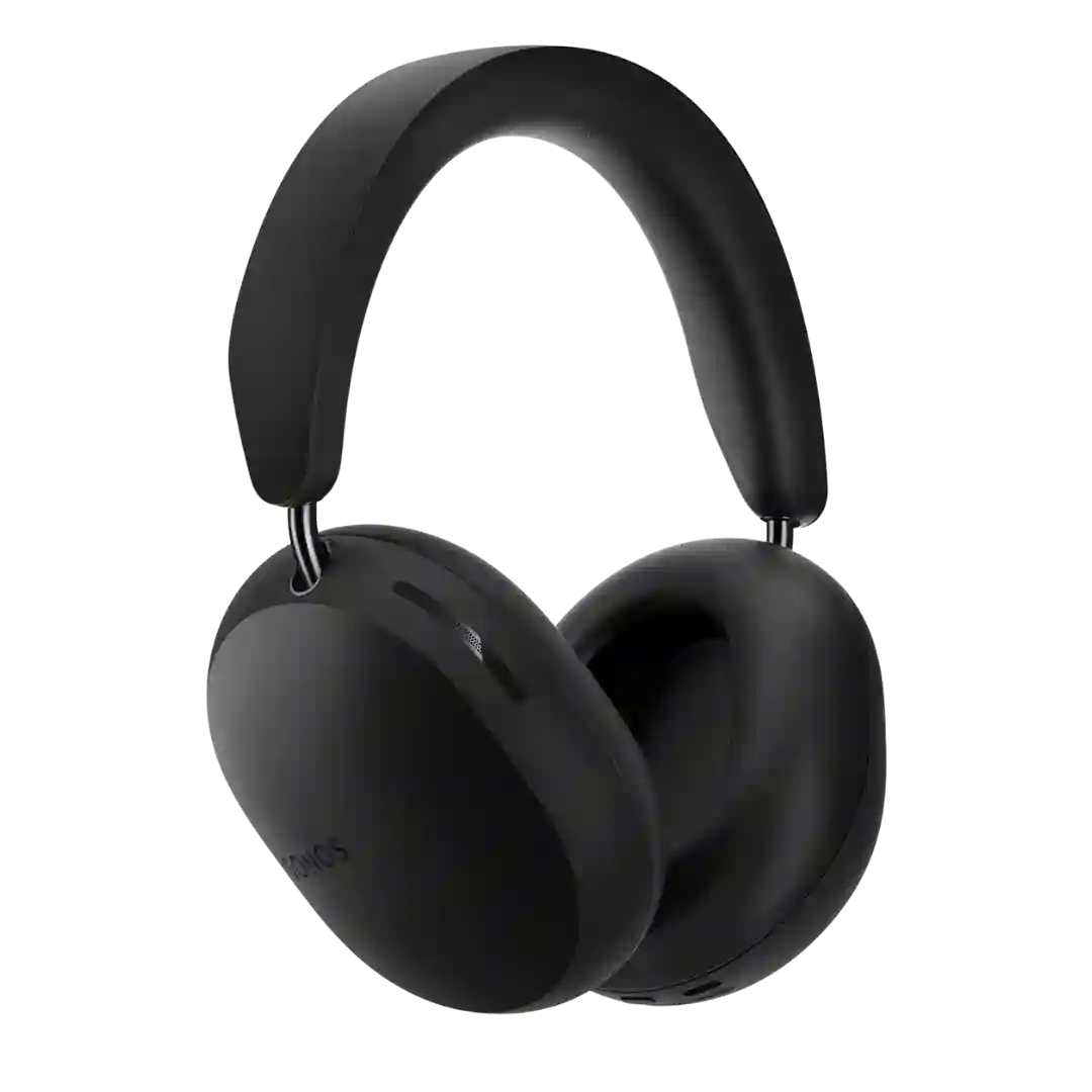
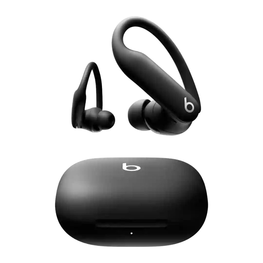
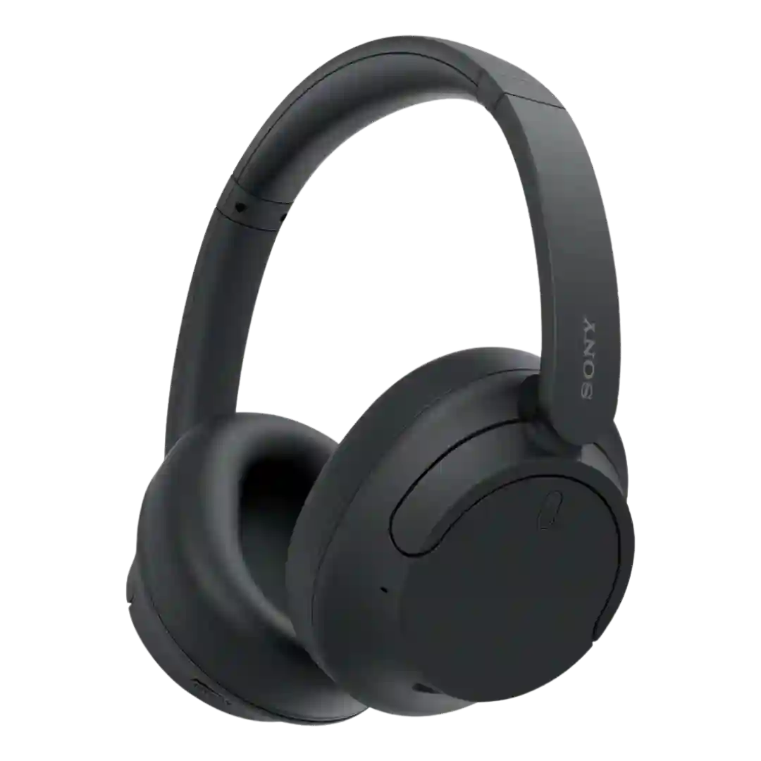
Design is often described as mature, minimalist, and stylish, with subdued colorways compared with older flashy Beats models. A few reviews call the look familiar or unchanged, but still iconic.
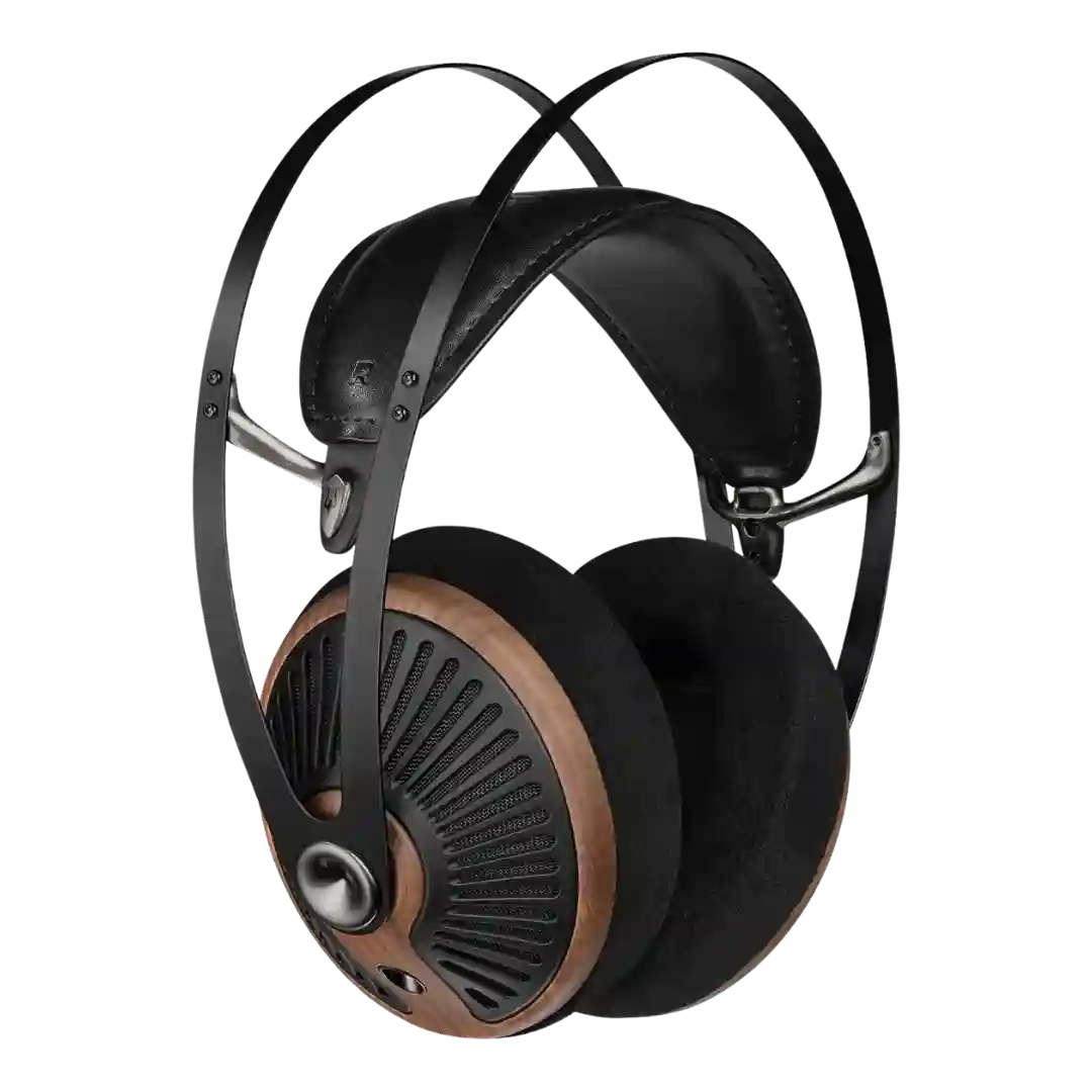
Design is a standout, with walnut accents and Meze’s mid-century styling repeatedly called premium-looking and distinctive. Even critics of the tuning tend to praise the aesthetics and finish quality.
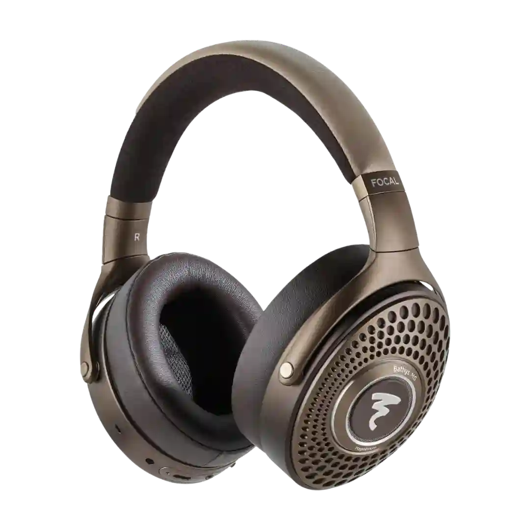
Design is a major selling point, with the chestnut finish, leather, metal accents, and illuminated logo giving the Bathys MG a clearly luxurious identity.
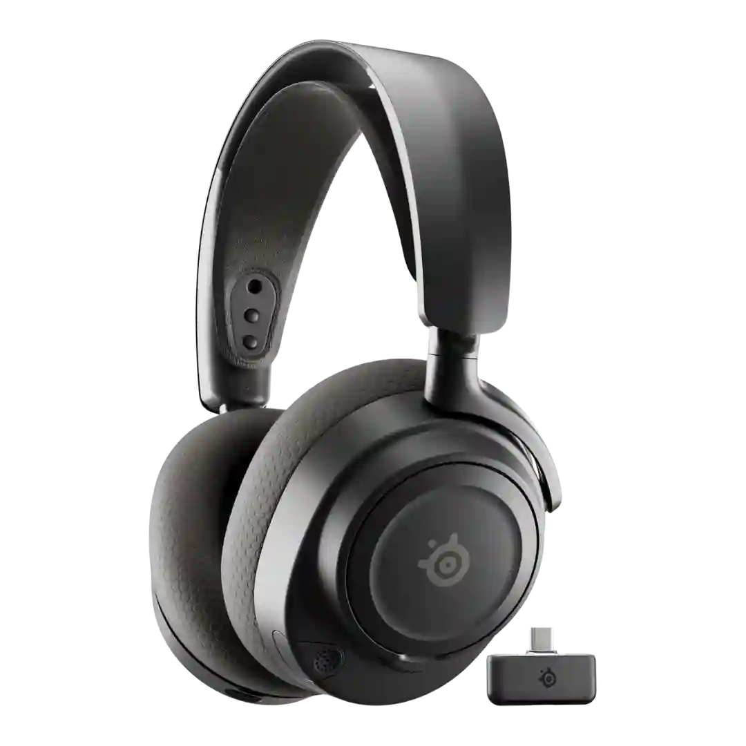
The design is widely liked for looking sleek and not overly gamer-styled, making it plausible as everyday headphones. Customization options like alternate plates/headbands are also mentioned as a nice bonus.
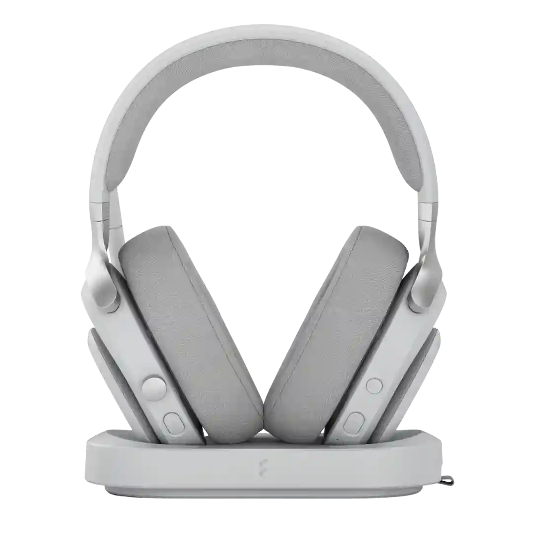
Across reviews, Scape is repeatedly praised for a minimalist, premium look that reads more like a luxury headphone than a typical gaming headset, with a clean dock that fits on a desk or living-room setup.
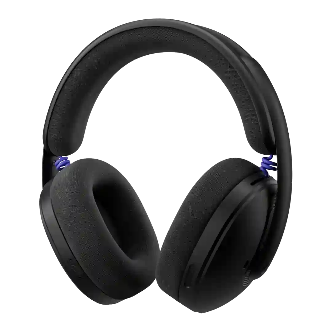
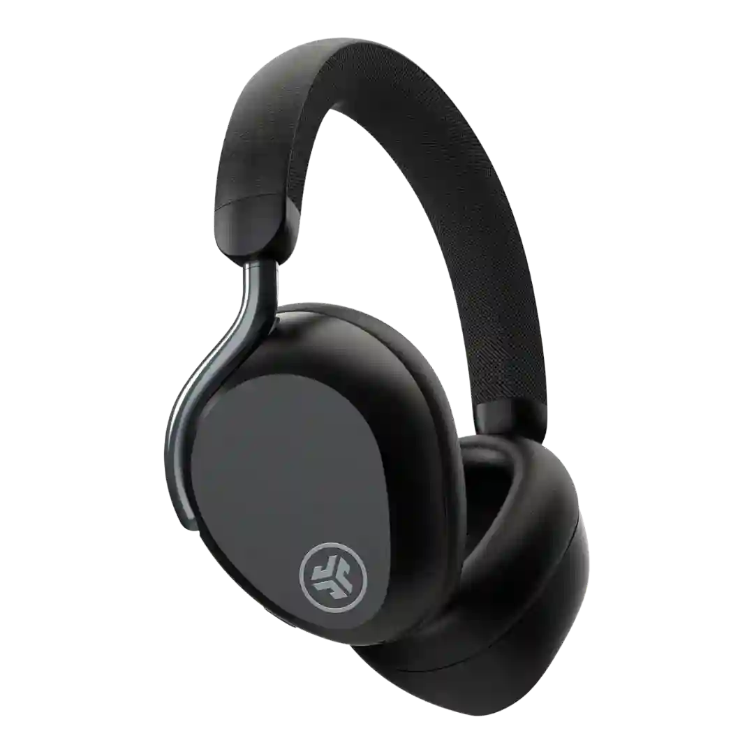
Design is a major positive. Reviewers repeatedly praise the understated, stylish look and the more everyday-headphone vibe, with the color options helping it stand out without leaning too hard into flashy gamer styling.
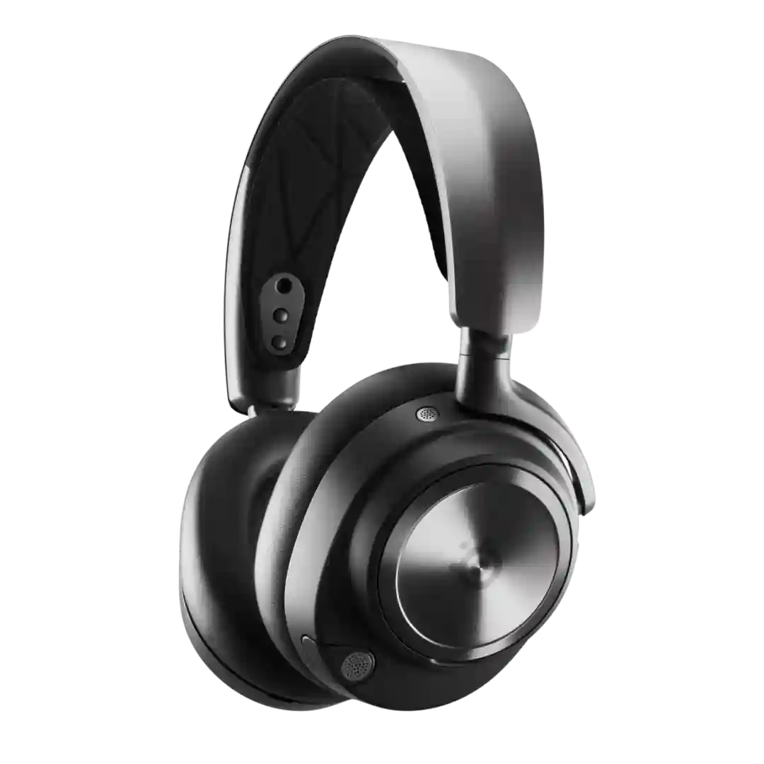
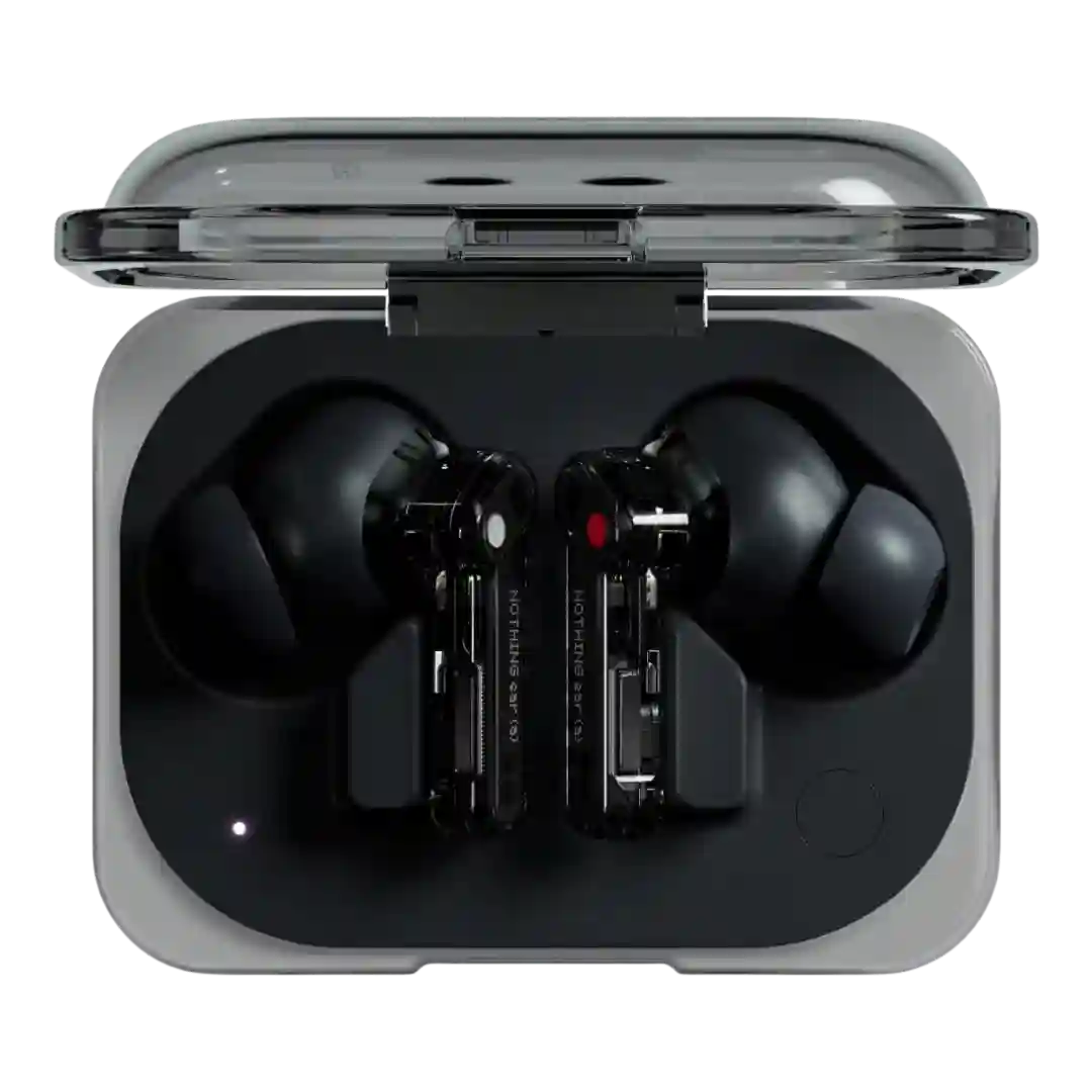
Design is consistently described as distinctive and polarizing, with many praising the transparent, cassette-like aesthetic and premium look for the price.
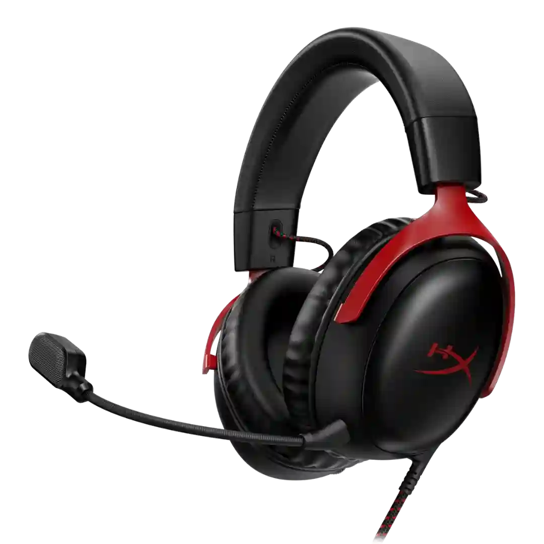
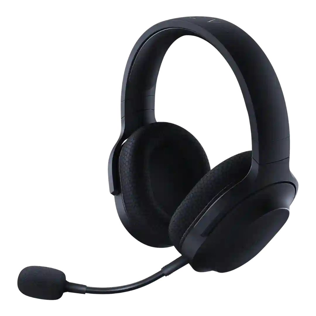
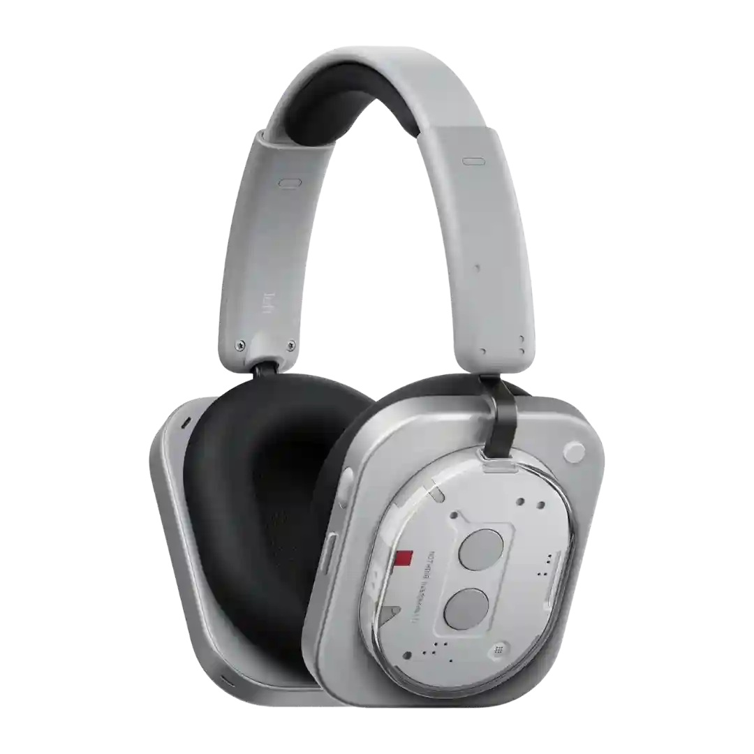
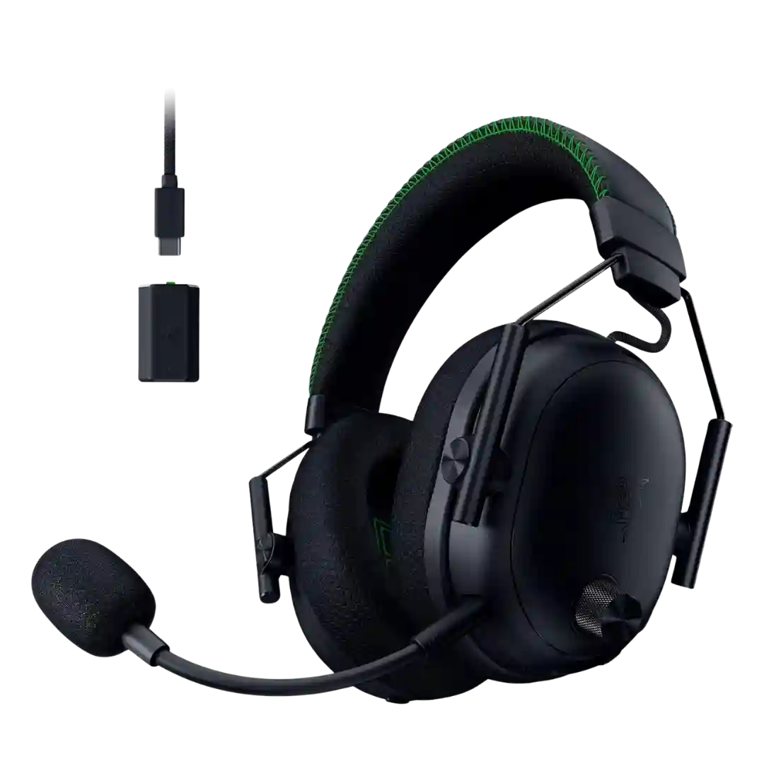
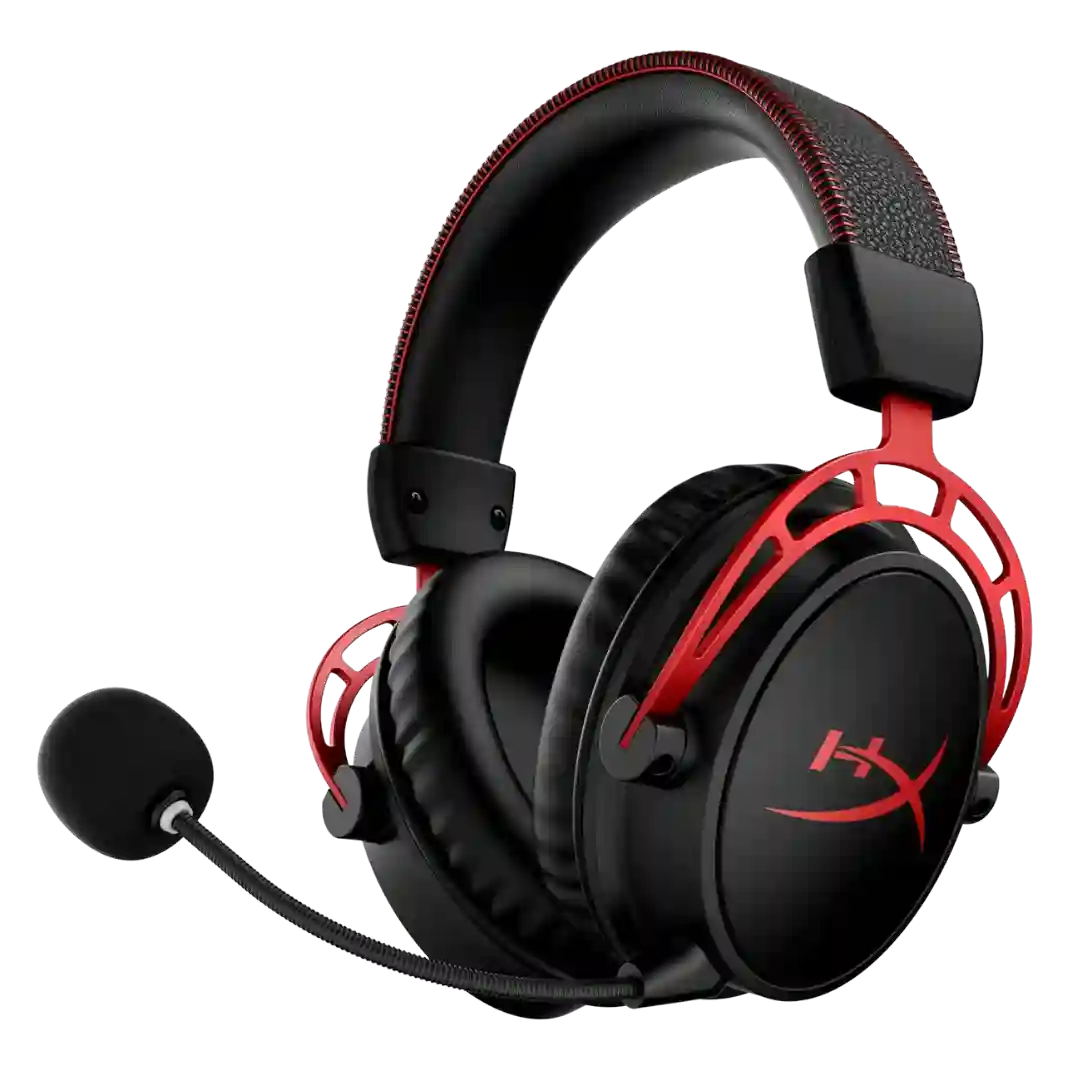
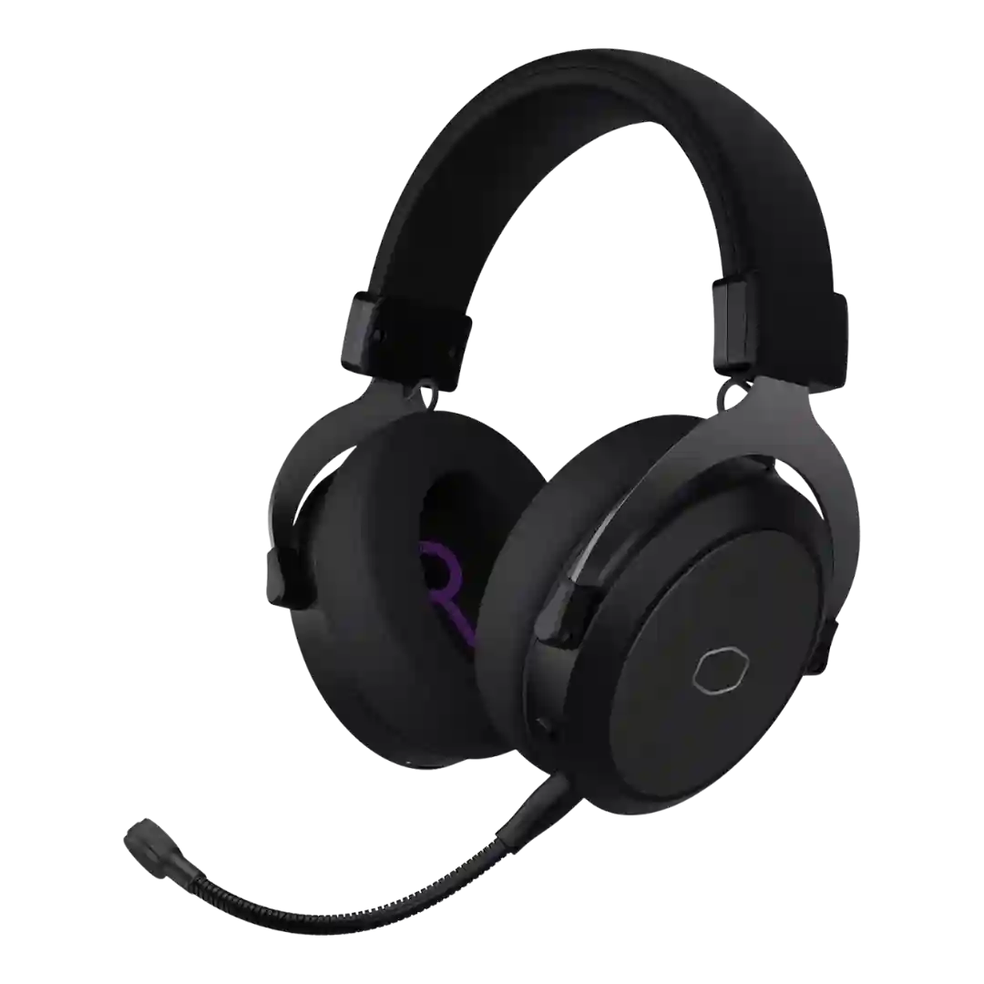
The BlackShark pilot-style look is consistently praised as sleek and professional, with a premium, understated aesthetic. Custom faceplates and refined stitching add personality without turning it into a flashy RGB headset.
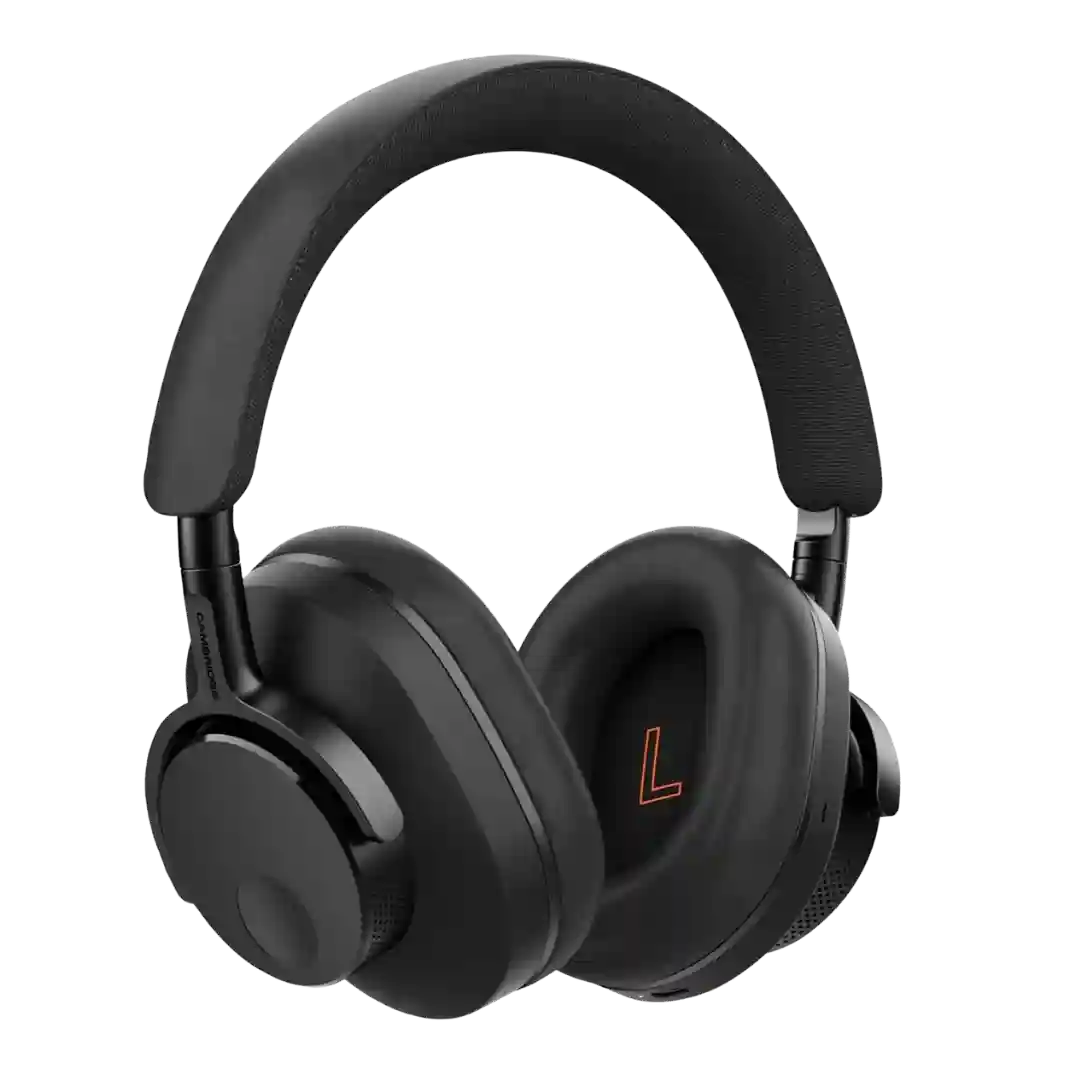
Design is broadly seen as sleek, minimalist, and premium, with physical controls that many find more reliable than touch pads. Cosmetic preferences vary, but the Ace generally scores high on aesthetics.
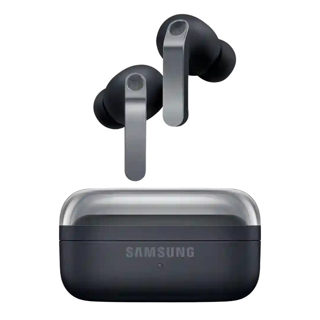
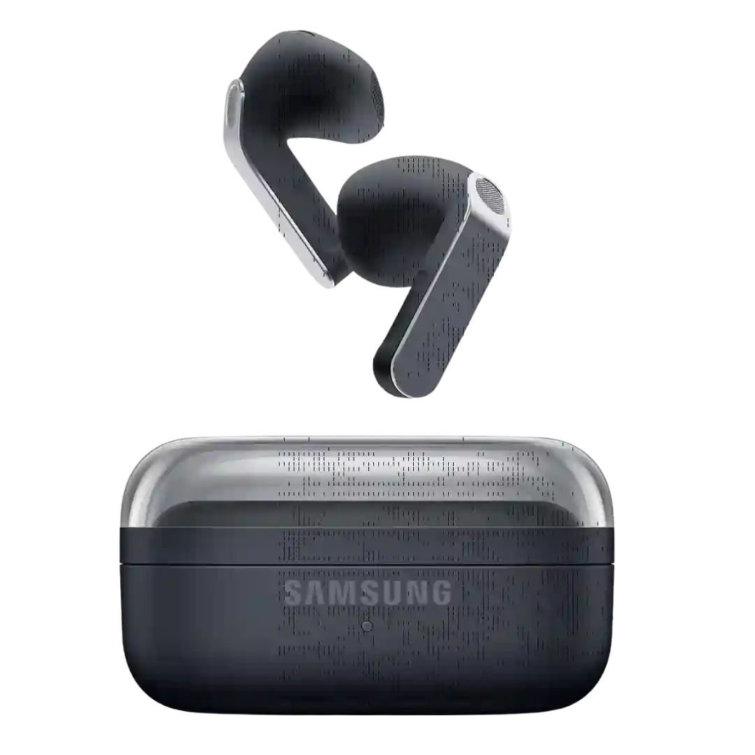
Samsung's new look is broadly seen as more polished and premium, with the flatter metallic stem and refined case helping the Buds 4 Pro feel more distinct and mature.
The redesign is widely seen as sleeker and more modern, with mixed reactions to the larger travel footprint; finishes are often described as clean and understated.
Design is repeatedly described as premium and stylish, with new colorways and a recognizable Momentum look. Many reviews note the external design is very similar to the prior generation, so upgrades are mostly internal.
Design is broadly seen as premium and tasteful with quality materials, though a few mention minor aesthetic nitpicks such as bulk or how it sits on the head.
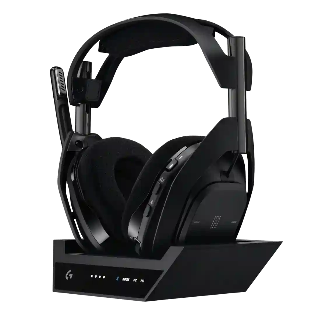
The design keeps the classic Astro look with a premium gamer aesthetic; opinions are broadly positive, with occasional notes about glossy parts and fingerprints.
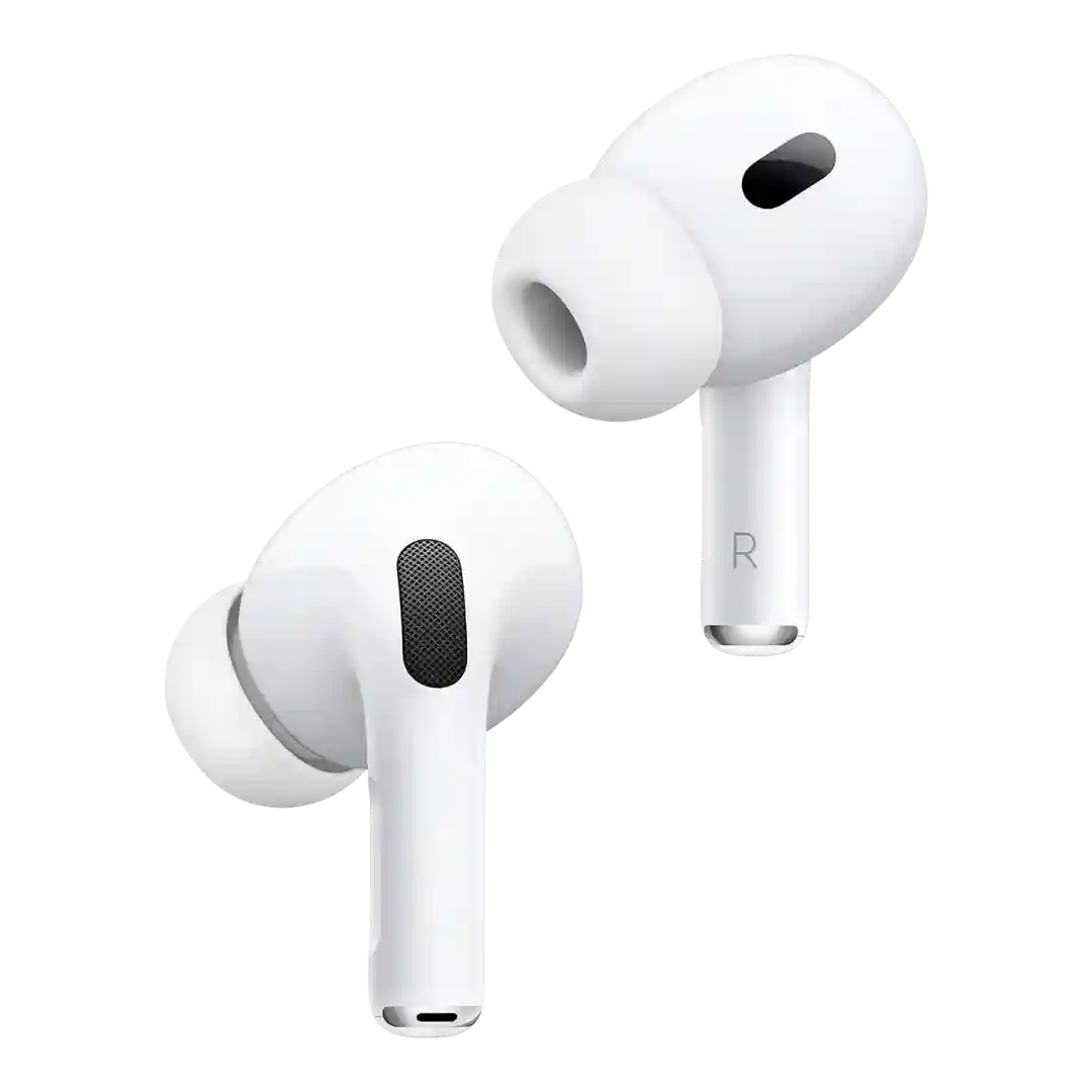
Design is described as iconic and modern, though some dislike being limited to white. The stem-based look is divisive aesthetically but ties into better controls and mic placement.
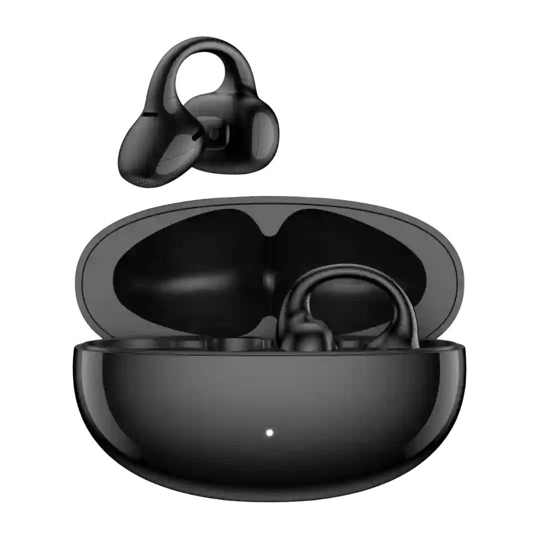
The redesign (smaller hook, slimmer housings, new colors) is widely seen as a meaningful refinement over gen 1, improving ergonomics and how they work with glasses, even if the look is still more conspicuous than standard earbuds.
Design feedback is favorable overall: slimmer stems, a cleaner case, and a more polished look improve the presentation. The main knock is that the styling still feels very close to Apple's template.
Design is generally seen as sleek and premium-looking, leaning understated rather than flashy; finish impressions vary from fingerprint-resistant to smudge-prone.
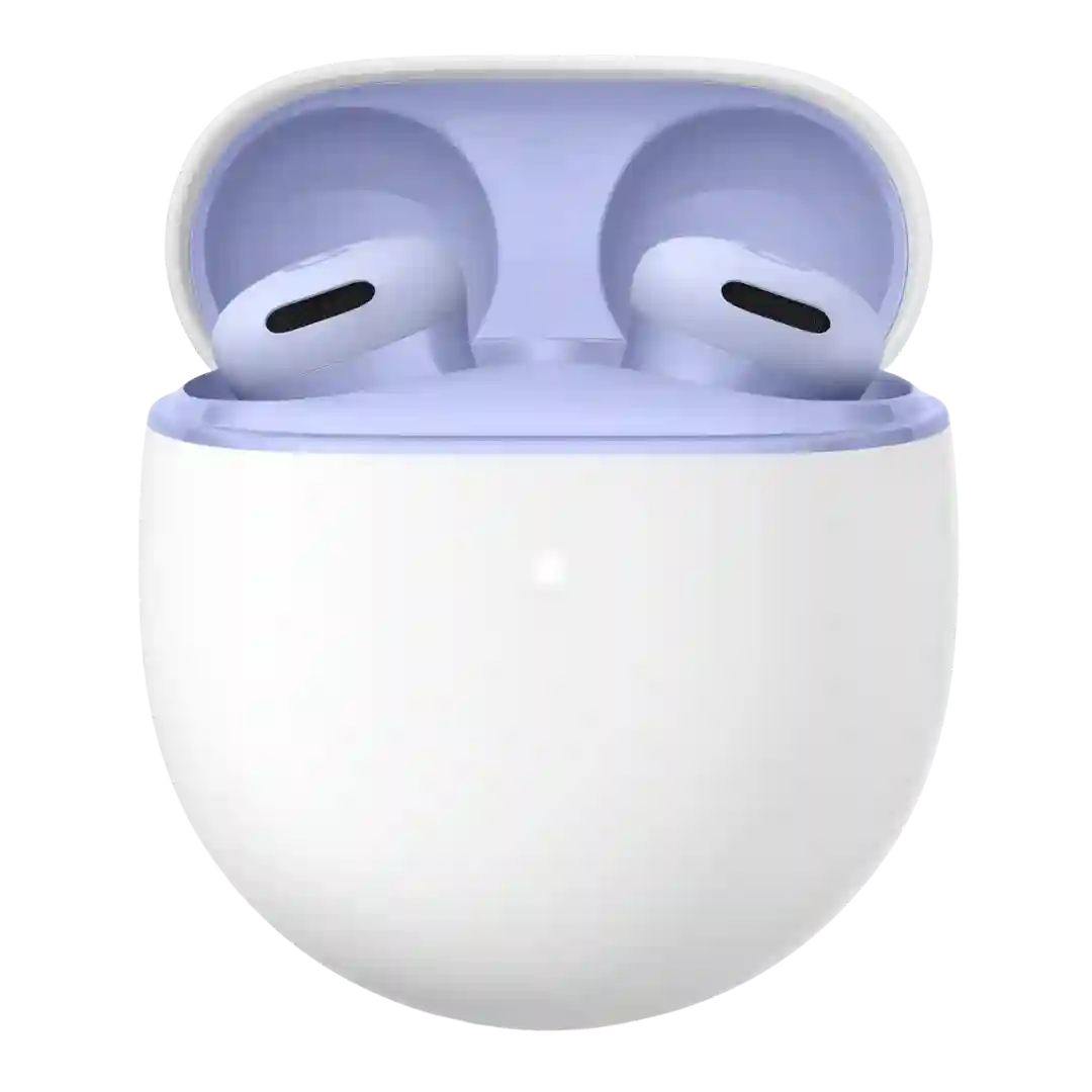
Design feedback is mostly positive thanks to clean lines and fun color options (like aqua and lavender), with the main critique being that the mostly plastic shell can look or feel less premium.
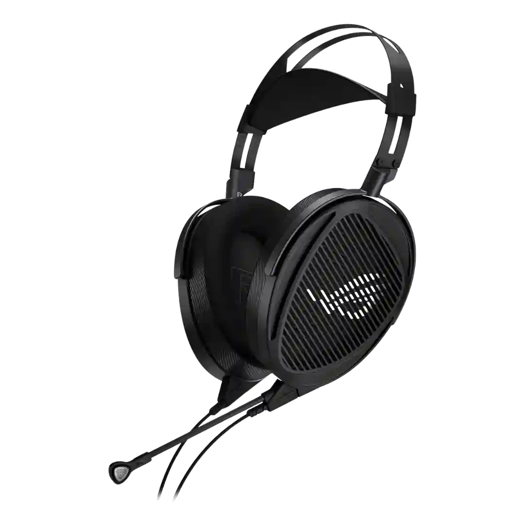
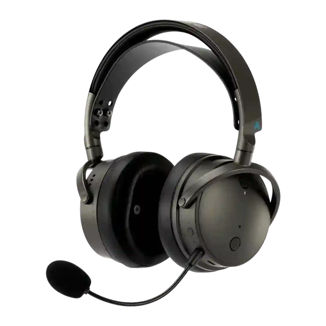
The standard version is repeatedly described as clean, technical, and professional rather than flashy. Buyers who want more visual personality can lean on the Club styling or the customizable outer earcups.
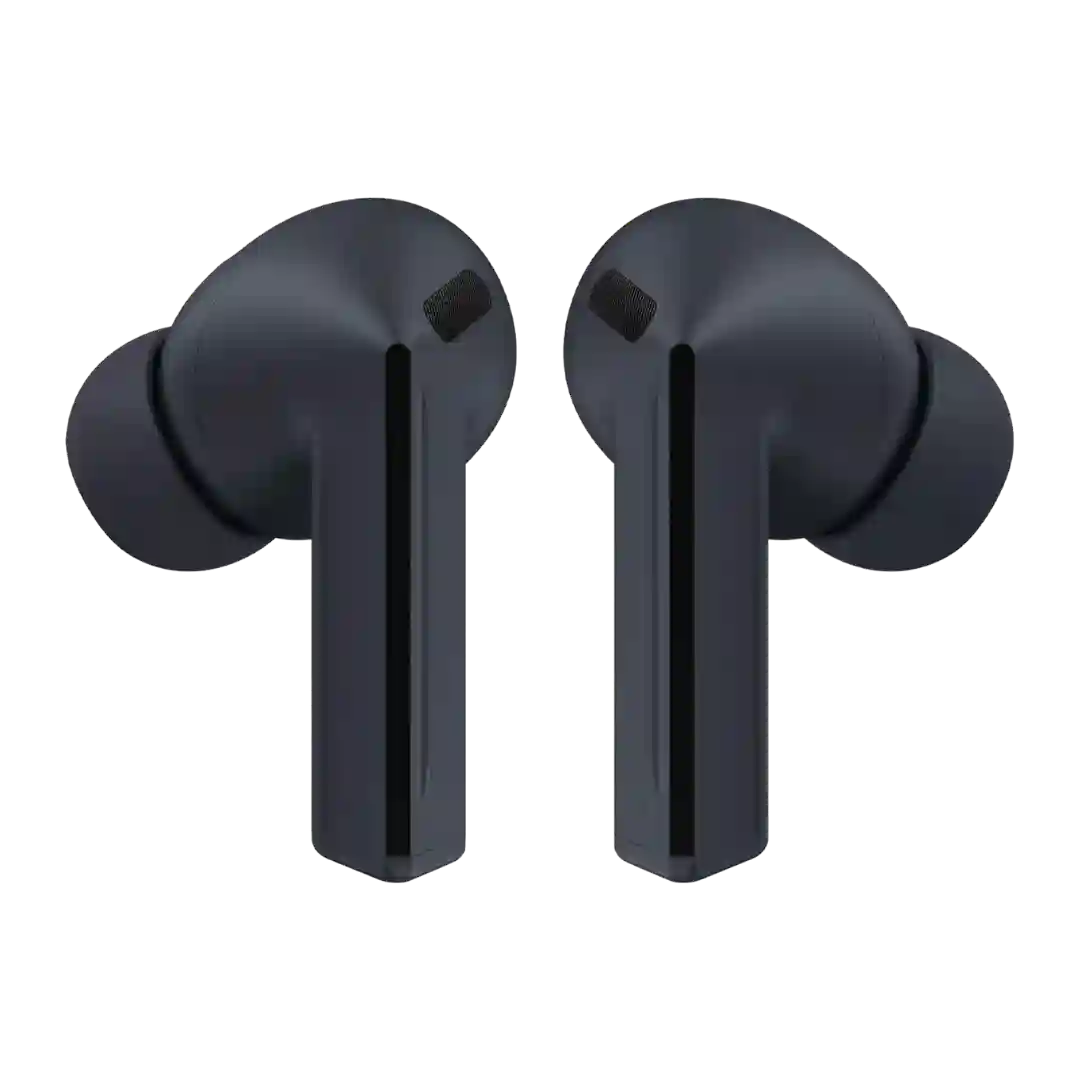
Design shifts to a more minimalist, matte look with improved grip and fewer flashy accents. Some find the buds and case plain or bulky, but most agree the finish is practical and modern.
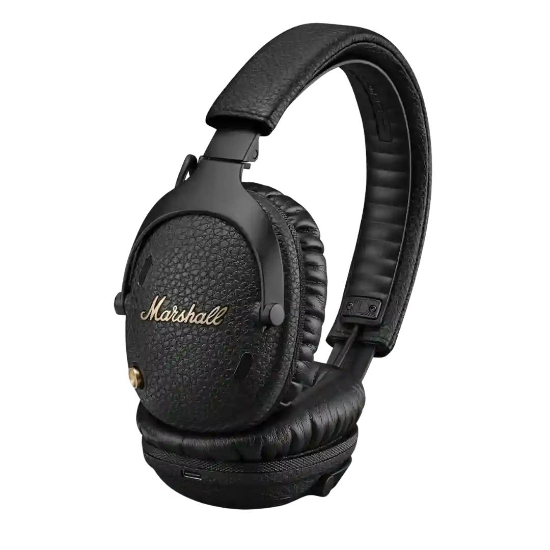
Design is classic Marshall amp-inspired with textured finishes and brass/gold accents; it feels premium to fans but can be polarizing for those who prefer modern styling.
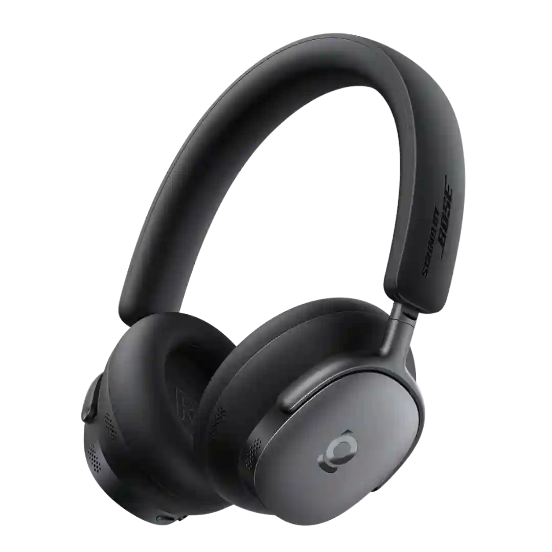
Design is generally viewed as understated and unobtrusive, with color options often mentioned; premium styling is sometimes credited more to the Ultra variant.
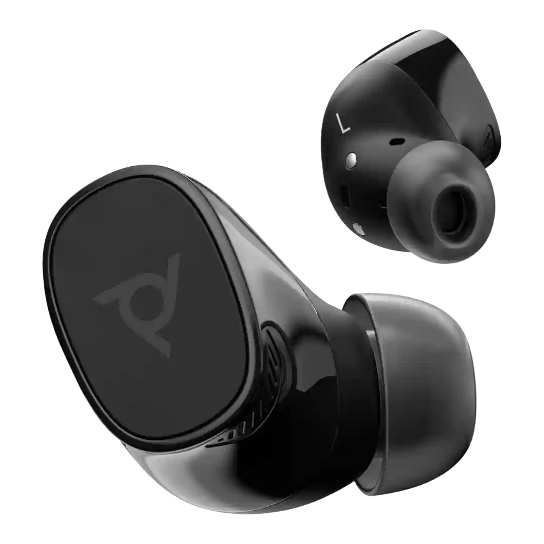
Design is praised for being smaller, more discreet, and premium-looking, but the glossy surfaces can be slippery and not everyone loves the foam-tip approach.
The matte, understated look is repeatedly praised, with many liking the premium-feeling Buds 3 Pro-like shape while noting the absence of decorative blade lights as a cost-saving simplification.
Design is generally described as minimalist and attractive enough for everyday wear, with common color options and a clean look that reads more understated than flashy.