Best for visual style
Dark Winds, Season 4
4.9 feature score
Highest scored product for this feature based on supporting review evidence.
Highest scored product for this feature based on supporting review evidence.
Balances feature score, supporting reviews, and overall product strength.
Has the broadest review evidence for this feature.
Strongest overall product among items with scored evidence for this feature.
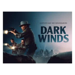
The visual style is moody, eerie, and more horror-tinged than before. Neon, red police lights, desert spaces, and L.A. period texture help the season stand out.
Pros: costume design, directing quality
Cons: family friendliness, age appropriateness
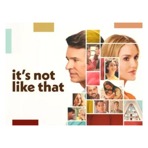
Clean imagery and thoughtful framing support the emotional tone, including a restrained apparition device that keeps Jenny's absence visually present.
Pros: season finale quality, screenplay quality
Cons: character consistency, continuity

Visual presentation is one of the strongest areas. Reviewers praise the restored footage, colorized stills, and unusually vivid use of video and imagery to make WWII feel immediate.
Pros: visual style, realism
Cons: episode pacing, season pacing
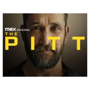
The visual style is grounded rather than flashy, with praise for Pittsburgh scenery, tight hospital shots, and a well-shot real-time feel. Some viewers warn that the medical imagery can be...
Pros: episode structure, main cast performance
Cons: age appropriateness, plot clarity
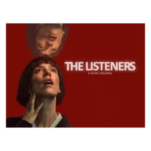
The visual language is a major selling point: chilly, muted, filmic, and often hypnotic. Even mixed critics tend to notice the show’s distinctive art-house texture.
Pros: main cast performance, critic appeal
Cons: character consistency, finale satisfaction
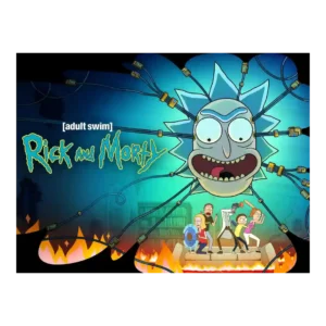
The visual style is praised for scope, spectacle, smoothness, and distinct simplicity. Episode 7’s life-cycle sequence and the premiere’s scale are singled out as memorable visual moments.
Pros: critic appeal, genre satisfaction
Cons: family friendliness, age appropriateness
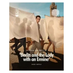
Glossy sunlight, elegant clothing, polished locations, and heightened romantic imagery remain among the season’s most dependable strengths.
Pros: main cast performance, bingeability
Cons: realism, season length
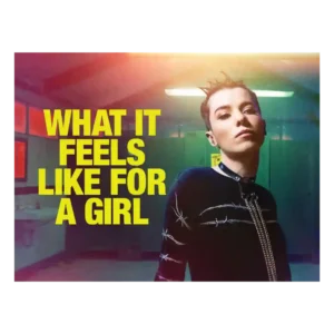
The visual style is bold and memorable, from shifting color palettes to dreamlike flourishes. Even short viewer reactions singled out the visuals as a selling point.
Pros: genre satisfaction, main cast performance
Cons: family friendliness, violence level
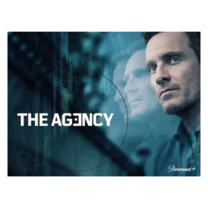
The season’s visual style is described as moody, stylish, and polished, especially in how it distinguishes offices from global field locations. It supports the adult thriller tone without becoming the...
Pros: directing quality, bingeability
Cons: none
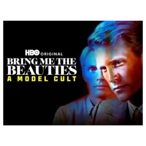
Visual style gets a notable lift from the quoted Wall Street Journal appraisal. The show is framed as stylishly constructed rather than merely lurid.
Pros: bingeability, critic appeal
Cons: editing quality, accountability handling
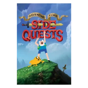
The redesigned look is the most discussed craft element and is mostly praised as fresh, playful, colorful, and still recognizable. A few fans were skeptical at first, but several reviewers...
Pros: production design, animation quality
Cons: pilot episode quality, score quality
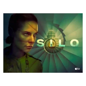
Reviewers like the new visual contrast between the bright Before Times and the dim underground world. The season looks more varied while keeping the silo’s oppressive identity intact.
Pros: drama quality, finale satisfaction
Cons: character development, season pacing
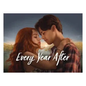
The lakeside look is one of the most reliable positives. Even mixed or negative reviews often admire the summer atmosphere, Barry’s Bay scenery, and warm visual mood.
Pros: directing quality, cinematography
Cons: character consistency, writing quality
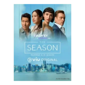
Visuals are the clearest consensus strength. Even negative takes praise the gorgeous Hong Kong setting, yacht-party glamour, and scenery that sometimes outshines the script.
Pros: world-building, cinematography
Cons: finale satisfaction, season finale quality
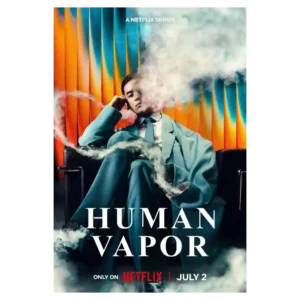
The series has a strong visual identity, from the gloomy palette to the wider Japanese settings. Several reviewers call the production gorgeous or cinematic even when they dislike the pacing.
Pros: plot originality, emotional impact
Cons: humor, writing quality
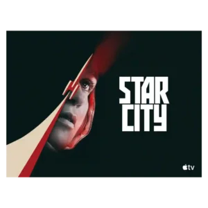
The visual style is cold, gray, analog, and intentionally oppressive, which fits the Soviet-side story well. Most praise its atmosphere, though its bleak palette can make the show feel heavy.
Pros: cliffhanger effectiveness, main cast performance
Cons: humor, family friendliness
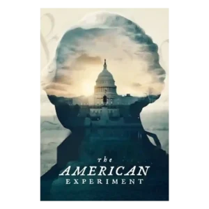
The polished museum-display look, clean visual rhythm, staged reenactments, and approachable documentary movement are major strengths. The same gloss can sometimes soften the messier tensions.
Pros: production design, bingeability
Cons: modern political framing, plot originality
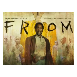
The visual style is strongest when the town itself turns hostile: black skies, red-light dread, and deliberate framing make the supernatural threat feel immediate.
Pros: directing quality, rewatch value
Cons: value for money, makeup quality
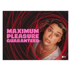
The visual style is bold and voyeuristic, matching a story about screens, privacy, and watching. Its high-octane look is part of the appeal, especially for viewers who like heightened neo-noir...
Pros: acting quality, main cast performance
Cons: family friendliness, age appropriateness
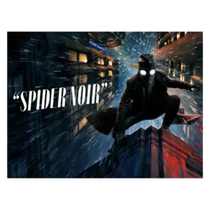
Visual style is the most consistently praised craft area. Reviewers love the black-and-white noir look, shadowy lighting, period styling, and bold color option, though some find the color version more...
Pros: plot twists, cliffhanger effectiveness
Cons: family friendliness, age appropriateness
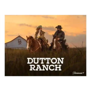
Visual style is a strength even for mixed critics. The Texas heat, dusty ranch spaces, and open landscapes help the spinoff feel tactile, though one review pairs the arresting imagery...
Pros: cast chemistry, acting quality
Cons: continuity, cultural representation
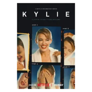
The visual approach is usually praised for personal archives and quiet restraint, though one critic dislikes the shifting aspect ratios.
Pros: episode pacing, season finale quality
Cons: episode structure, season pacing
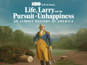
The visual style benefits from period recreations and occasional less-stagey direction. Reviewers generally like the look more than the sketch writing.
Pros: realism, costume design
Cons: editing quality, episode length
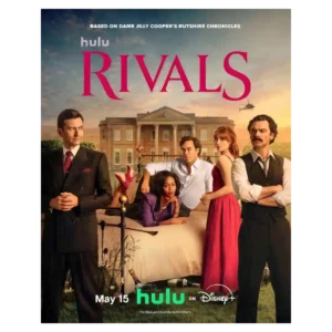
The hyper-saturated palette, sweeping countryside, playful camerawork, and extravagant interiors create a bold look, though some flourishes can be too much.
Pros: score quality, critic appeal
Cons: character consistency, plot clarity
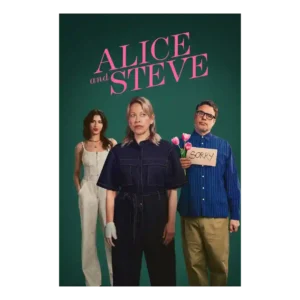
The series has a wry, stylish feel, even in a review that did not find it especially funny. Its look and tone help keep the short episodes breezy.
Pros: directing quality, cast chemistry
Cons: family friendliness, language level
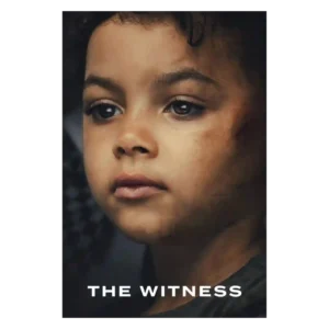
The visual style helps the non-linear story stay readable by clearly separating eras. That clarity matters because the series moves between 1990s aftermath and later reopening.
Pros: screenplay quality, critic appeal
Cons: plot twists, season pacing
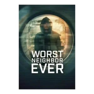
The visual style is a selling point when the mix of stylized visuals, reenactments, and documentary material feels slick. One critic disliked inconsistent visual transitions, so the presentation is not...
Pros: finale satisfaction, season finale quality
Cons: violence level, writing quality
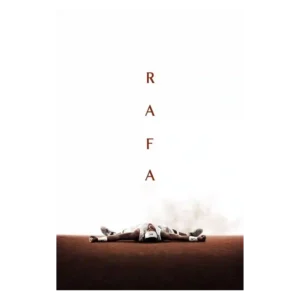
The visual presentation is polished and sometimes striking, with praise for Rafa-on-court imagery and overall audiovisual craft. One critic’s caveat is that the luxurious surface can make the portrait feel...
Pros: genre satisfaction, soundtrack quality
Cons: writing quality, plot clarity
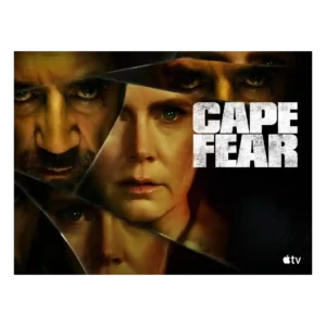
Visual style is bold and divisive: critics liked the lush Southern Gothic look, saturated colors, and dynamic cues, but some found the flourishes cheesy or overdone.
Pros: directing quality, cinematography
Cons: realism, character consistency
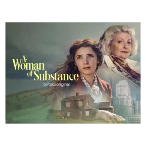
The visual style is sharply split. Some call every frame stunning and lush, while another found the pristine surfaces too toy-like and artificial.
Pros: season finale quality, main cast performance
Cons: humor, plot clarity
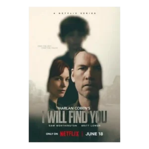
Visual style is serviceable rather than cinematic. Reviewers note Netflix polish and a procedural look, but the style is not described as a major standout.
Pros: cinematography, drama quality
Cons: writing quality, plot clarity
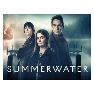
The visual style is moody and scenic, sometimes impressively so, but not always viewer-friendly. Critics praise the grey Scottish atmosphere while also complaining about murky, hard-to-see imagery.
Pros: supporting cast performance, season finale quality
Cons: season pacing, humor
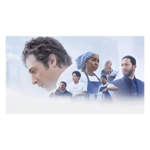
Visual style is split between gorgeous food imagery and complaints that the final season looks too stylized or lacks authenticity. Reviewers still praise the food photography when it supports character...
Pros: directing quality, cinematography
Cons: dialogue quality, plot originality
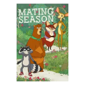
The look is highly divisive. Some praise the bright forest backgrounds, expressive animation, and eventual charm of the designs; others call the style corporate, ugly, or uninspired.
Pros: realism, cultural representation
Cons: age appropriateness, violence level
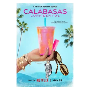
The show consistently looks glossy, polished, and Instagram-ready. That surface appeal is also part of the problem for critics who find the style cheap, overproduced, or hollow.
Pros: world-building, costume design
Cons: family friendliness, age appropriateness
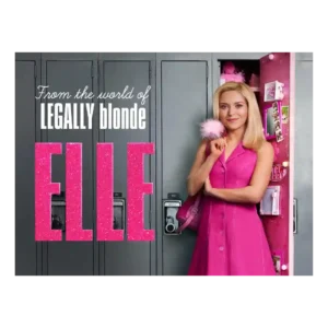
The visual style makes the pink-against-gray contrast easy to read. Some like the bold palette shift, while others find the Seattle look drab, sludgy, or not vibrant enough.
Pros: cast chemistry, bingeability
Cons: episode length, episode pacing
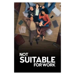
The visual style is glossy and aspirational, full of Manhattan polish and stylish surfaces. That look adds sparkle for some but reads as artificial or visually stale to others.
Pros: renewal interest, bingeability
Cons: plot clarity, soundtrack quality
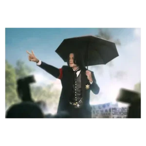
The look is mixed: one review says the production is technically fine, while a video reviewer strongly objects to dark, sinister Neverland imagery. The visual approach can feel polished but...
Pros: directing quality, modern political framing
Cons: value for money, family friendliness
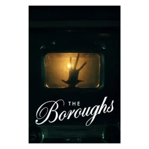
Visual style divided reviewers negatively where it came up. The washed-out palette, flat lighting, and muddy coloring were called out as limiting the wonder of the desert and supernatural imagery.
Pros: main cast performance, acting quality
Cons: cancellation satisfaction, plot clarity
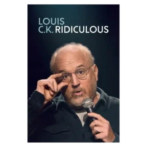
Visual presentation is not a major discussion point, though the close-up framing can feel awkward. The material and performance dominate the conversation far more than the look of the special.
Pros: main cast performance, dialogue quality
Cons: accountability handling, family friendliness