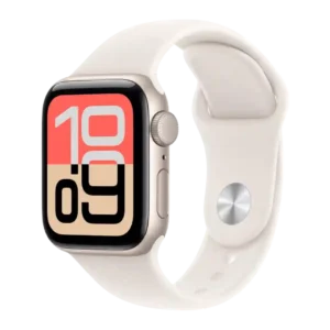
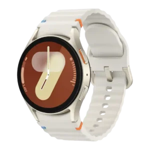
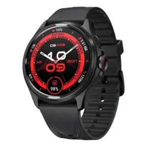
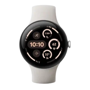
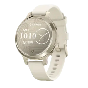
Best for menu navigation
Suunto Vertical
4.6 feature score
Highest scored product for this feature based on supporting review evidence.
Highest scored product for this feature based on supporting review evidence.
Balances feature score, supporting reviews, and overall product strength.
Has the broadest review evidence for this feature.
Strongest overall product among items with scored evidence for this feature.
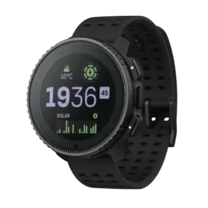
Menu navigation was described as intuitive and easy, with key settings and data not buried too deeply.
Pros: battery life, materials quality
Cons: ECG functionality, contactless payments
Menu navigation benefits greatly from the functional crown and easier scrolling, especially compared with touchscreen-only use.
Pros: step counting accuracy, button controls
Cons: LTE connectivity, cross-platform compatibility
Menu navigation is generally strong, especially through activity folders and full button control, although Garmin's depth can be complex.
Pros: GPS accuracy, brightness
Cons: ECG functionality, voice assistant quality
Menu navigation is generally easy, thanks to a crown, straightforward swipes, and clear controls.
Pros: workout tracking variety, software smoothness
Cons: LTE connectivity, Wi-Fi connectivity
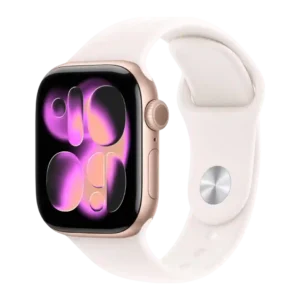
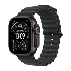
Menu navigation is easy and fast, helped by watchOS, the Digital Crown, touch controls, and one-handed gestures.
Pros: value for money, contactless payments
Cons: blood oxygen tracking, ECG functionality
Menu navigation is mostly intuitive and easy, supported by buttons, touchscreen, Glances, and refreshed menus, though phantom clicks hurt one review.
Pros: outdoor visibility, brightness
Cons: ECG functionality, LTE connectivity
Menu navigation is straightforward and polished through swipes, the crown, and shortcut controls.
Pros: water resistance, brightness
Cons: LTE connectivity, Wi-Fi connectivity
Menu navigation is simple, relying on straightforward swipes and easy access patterns rather than complex controls.
Pros: workout tracking variety, value for money
Cons: ECG functionality, third-party app support
Menu navigation is strong once learned, helped by touch, buttons, maps, widgets, and simplified switching between smartwatch and sport modes.
Pros: charging speed, build quality
Cons: LTE connectivity, ECG functionality
Menu navigation was generally considered easy or user-friendly, with Garmin's setup guidance and drill-down menus helping despite the dense feature set.
Pros: materials quality, durability
Cons: LTE connectivity, value for money
Menu navigation was generally intuitive, with reviewers liking Glances, swipes, activities/apps separation, and quick access to common stats.
Pros: heart rate accuracy, display quality
Cons: LTE connectivity, third-party app support
Menu navigation is helped by the crown, complications, Modular Ultra, and Smart Stack, which reviewers generally find useful for quick glanceable information.
Pros: display quality, heart rate accuracy
Cons: cross-platform compatibility, recovery insights
Menu navigation was praised as easier and more intuitive thanks to the second button, touchscreen layout, and clearly arranged menus.
Pros: pairing reliability, display quality
Cons: heart rate accuracy, sleep tracking accuracy
Menu navigation is a highlight thanks to the rotating crown and easier scrolling through apps, notifications, and menus.
Pros: battery life, pairing reliability
Cons: ECG functionality, LTE connectivity
Menu navigation is considered easy, with swipe and crown navigation working well in the reviews that focused on everyday interaction.
Pros: outdoor visibility, charging speed
Cons: stress tracking, band quality
Navigation is mostly praised as easy, swipe-based, and responsive, with menus that are simple to operate on the large screen.
Pros: value for money, workout tracking variety
Cons: onboard music storage, contactless payments
Menu navigation was generally intuitive through swipes, tiles, the digital bezel, and consistent menu behavior, though some missed a physical rotating control.
Pros: user interface, build quality
Cons: antioxidant index, cross-platform compatibility
Menu navigation is well supported by list/grid views, crown scrolling, quick workout access, and smooth app layout options.
Pros: step counting accuracy, onboard music storage
Cons: ECG functionality, Wi-Fi connectivity
Menu navigation is usually intuitive through swipes, tiles, digital bezel, and app navigation, with mostly positive responsiveness comments.
Pros: workout tracking variety, materials quality
Cons: size options, cross-platform compatibility
Menu navigation is generally approachable for Garmin users, with button and touchscreen options, though some newcomers may find the system dense.
Pros: mapping and navigation, watch face quality
Cons: ECG functionality, LTE connectivity
Menu navigation is generally smooth and easy, especially through the rotating crown and simplified app views.
Pros: durability, battery life
Cons: ECG functionality, voice assistant quality

Navigation is mostly intuitive, especially with the Classic's rotating bezel, while the standard touch bezel drew more mixed reactions.
Pros: outdoor visibility, workout tracking variety
Cons: cross-platform compatibility, battery life
Menu navigation is mostly straightforward through swipes, app drawers, digital bezel haptics, and simple operation.
Pros: brightness, durability
Cons: cross-platform compatibility, value for money
Menu navigation is aided by the rotating crown and physical controls, though general Wear OS navigation quality depends on the software version.
Pros: materials quality, style and design
Cons: blood oxygen tracking, ECG functionality
Menu navigation was mostly clear and helped by the crown, though some button/crown issues kept it from being universally polished.
Pros: battery life, durability
Cons: ECG functionality, LTE connectivity
Menu navigation improved with the grid launcher and intuitive controls, but some Wear OS screens still required extra scrolling.
Pros: outdoor visibility, health tracking accuracy
Cons: cross-platform compatibility, durability
Menu navigation is a strength, with reviewers calling it easy, intuitive and simple to move through by touch or gestures.
Pros: fit, battery life
Cons: call handling, voice assistant quality
Menu navigation is generally intuitive through swipes, buttons, tiles, and quick toggles, though the lack of crown means more touch navigation.
Pros: charging speed, workout tracking variety
Cons: ECG functionality, LTE connectivity
Menu navigation is generally approachable, with easy swipes and button-plus-touch operation, though not every reviewer likes the app list or navigation layout.
Pros: workout tracking variety, value for money
Cons: ECG functionality, LTE connectivity
Menu navigation is straightforward, using the Digital Crown, larger interface buttons, synced apps, and simple app access.
Pros: contactless payments, pairing reliability
Cons: cross-platform compatibility, recovery insights
Menu navigation is mostly simple and smooth through swipes and the crown, though the crown does not control every screen.
Pros: pairing reliability, workout tracking variety
Cons: ECG functionality, contactless payments
Menu navigation is workable and improved, with swipes, glances, and widgets described as usable, though the touch-first approach creates tradeoffs.
Pros: outdoor visibility, brightness
Cons: LTE connectivity, charging convenience
Menu navigation is flexible because Garmin allows almost everything to be controlled by buttons, reducing reliance on touch.
Pros: brightness, outdoor visibility
Cons: ECG functionality, voice assistant quality
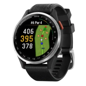
Menu navigation was generally intuitive after a short learning curve, though several reviewers said the many golf features take time to learn.
Pros: battery life, GPS accuracy
Cons: voice assistant quality, onboard music storage
Menu navigation is straightforward through swipes, simple app launching, and a low learning curve.
Pros: value for money, comfort
Cons: contactless payments, onboard music storage

Menu navigation is generally fast and intuitive, with the crown and streamlined menus helping, though one reviewer found scrolling finicky.
Pros: brightness, outdoor visibility
Cons: contactless payments, music controls
Menu navigation is generally straightforward, with swipe-based shortcuts and easy controls, though one reviewer wanted more parent-side control.
Pros: charging speed, user interface
Cons: sleep tracking accuracy, onboard music storage
Menu navigation is straightforward and crown-assisted, though some reviewers note the interface does not fully exploit the crown or gestures.
Pros: workout tracking variety, operating system experience
Cons: contactless payments, Wi-Fi connectivity
Menu navigation is easy overall, helped by the rotating crown, app grid/list options, and stacked widget layout.
Pros: pairing reliability, step counting accuracy
Cons: ECG functionality, voice assistant quality
Menu navigation is improved by the tiled interface, which reviewers found easier, cleaner, and more readable.
Pros: pairing reliability, cross-platform compatibility
Cons: third-party app support, music controls
Menu navigation through the crown was easy for reviewers after adjustment, despite the small display.
Pros: style and design, build quality
Cons: blood oxygen tracking, ECG functionality
Menu navigation is simple and responsive, helped by the control-center style layout and faster processor.
Pros: cross-platform compatibility, fit
Cons: call handling, voice assistant quality
Menu navigation benefits from the new physical buttons and simple swiping, though some reviewers needed time to adjust.
Pros: comfort, style and design
Cons: ECG functionality, onboard music storage
Menu navigation is generally easy thanks to swipes, widgets, and the crown, with the large screen helping readability.
Pros: workout tracking variety, battery life
Cons: onboard music storage, LTE connectivity
Menu navigation is simple and crown-driven, generally praised as intuitive despite the tiny display.
Pros: software smoothness, safety features
Cons: contactless payments, music controls
Menu navigation is simple and approachable when discussed, but navigation can be slowed by reliance on touch and manual sync behavior.
Pros: operating system experience, charging speed
Cons: blood oxygen tracking, third-party app support

Menu navigation is considered straightforward, helped by simple settings navigation and a clear menu structure.
Pros: touchscreen responsiveness, software smoothness
Cons: contactless payments, onboard music storage
Menu navigation in the Workout app is described as improved and better organized, though this was not a major review focus.
Pros: pairing reliability, app ecosystem
Cons: cross-platform compatibility, size options
Menu navigation is mostly usable and data-forward, with some learning curve in Garmin’s interface.
Pros: brightness, outdoor visibility
Cons: ECG functionality, LTE connectivity
Menu navigation is straightforward and button-driven, with reviewers calling the watch simple to use after learning the layout.
Pros: workout tracking variety, comfort
Cons: blood oxygen tracking, ECG functionality