Best for user interface
Google Pixel Watch 4
4.7 feature score
Highest scored product for this feature based on supporting review evidence.
Highest scored product for this feature based on supporting review evidence.
Balances feature score, supporting reviews, and overall product strength.
Has the broadest review evidence for this feature.
Strongest overall product among items with scored evidence for this feature.
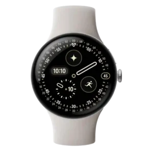
The user interface is widely praised for Material 3 Expressive, rich colors, rounded layouts and a more fluid, cohesive watch experience.
Pros: outdoor visibility, charging speed
Cons: stress tracking, band quality
The interface is generally beginner-friendly, smooth, and jargon-free.
Pros: outdoor visibility, software smoothness
Cons: ECG functionality, LTE connectivity
The user interface is praised as slick, intuitive, attractive, and more polished than typical kids smartwatch software.
Pros: charging speed, user interface
Cons: sleep tracking accuracy, onboard music storage
The user interface is polished, responsive, and intuitive, especially for core watch and fitness tasks.
Pros: workout tracking variety, software smoothness
Cons: LTE connectivity, Wi-Fi connectivity
The user interface is considered simple and easy to use, helped by large tiles and a smooth swipe-driven layout.
Pros: workout tracking variety, value for money
Cons: ECG functionality, third-party app support
The user interface is praised as clean, cohesive, fluid, easy to use, and refreshed by watchOS 26.
Pros: contactless payments, pairing reliability
Cons: cross-platform compatibility, recovery insights
The interface was praised as slick, consistent, and easy to learn, though dense settings and a digital bezel kept it from feeling effortless for everyone.
Pros: user interface, build quality
Cons: antioxidant index, cross-platform compatibility
The user interface is generally easy and polished, especially for iPhone users, Smart Stack, and redesigned watchOS apps.
Pros: display quality, heart rate accuracy
Cons: cross-platform compatibility, recovery insights
The user interface is a strength, with reviewers calling it intuitive, focused, and easier than some rival systems.
Pros: brightness, outdoor visibility
Cons: contactless payments, music controls
User interface evidence was positive where reviewers highlighted quicker menus and an easy-to-use widget/glance structure.
Pros: button controls, GPS accuracy
Cons: LTE connectivity, size options
The user interface is easy and polished, with simple navigation and a smoother layout than previous models.
Pros: water resistance, brightness
Cons: LTE connectivity, Wi-Fi connectivity
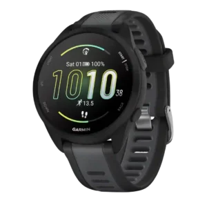
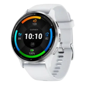
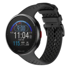
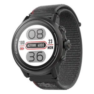
The AMOLED-era interface is clearer, smoother, and more colorful, while still retaining Garmin’s dense data-first structure.
Pros: mapping and navigation, watch face quality
Cons: ECG functionality, LTE connectivity
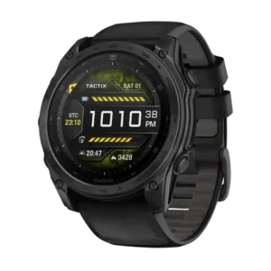
The user interface was considered approachable and easy to use, especially with the combined touchscreen and button approach.
Pros: brightness, outdoor visibility
Cons: ECG functionality, voice assistant quality
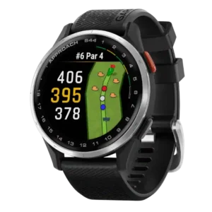
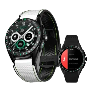
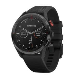
The user interface was considered simple and quick to understand, especially for golfers who wanted essential features without overwhelm.
Pros: pairing reliability, display quality
Cons: heart rate accuracy, sleep tracking accuracy
The user interface was generally praised as user-friendly and easy to navigate, even for users new to smartwatches, despite dense menus.
Pros: materials quality, durability
Cons: LTE connectivity, value for money
The user interface is easy to understand, with swipe-based quick settings, app access, widgets, and control panels highlighted.
Pros: workout tracking variety, materials quality
Cons: size options, cross-platform compatibility
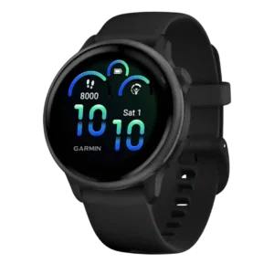
The user interface was broadly praised as intuitive and easier than older Garmin experiences, especially with the Activities/Apps split and Glances.
Pros: heart rate accuracy, display quality
Cons: LTE connectivity, third-party app support
The user interface was mostly praised as simple, intuitive, and easy to understand, even by reviewers who disliked the broader smartwatch limitations.
Pros: pairing reliability, brightness
Cons: third-party app support, music controls
The user interface is generally easy and Wear OS-like, with reviewers calling it logical or familiar.
Pros: battery life, pairing reliability
Cons: ECG functionality, LTE connectivity
The user interface is mostly praised as fluid, intuitive, and smooth, with some permission and organization caveats elsewhere.
Pros: step counting accuracy, onboard music storage
Cons: ECG functionality, Wi-Fi connectivity
The user interface earns praise for being clean, polished, readable, and visually appealing, especially with Nothing's minimal monochrome style.
Pros: workout tracking variety, operating system experience
Cons: contactless payments, Wi-Fi connectivity
The user interface is generally smooth and modern, with Liquid Glass and revised workout navigation praised, though minor glitches appear in one review.
Pros: pairing reliability, app ecosystem
Cons: cross-platform compatibility, size options
The user interface is one of the bigger upgrades, with Now Bar, better tiles, quick toggles, and smoother layouts drawing repeated praise.
Pros: third-party app support, heart rate accuracy
Cons: cross-platform compatibility, antioxidant index
The user interface is improved and functional, though some reviewers dislike parts of the visual layout.
Pros: brightness, durability
Cons: cross-platform compatibility, value for money
The interface is attractive and easy to use in TAG Heuer’s own apps, though broader Wear OS flow is less universally praised.
Pros: materials quality, style and design
Cons: blood oxygen tracking, ECG functionality
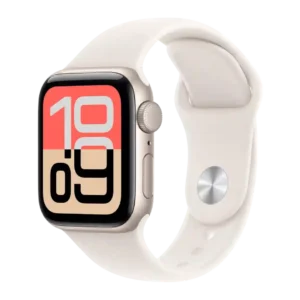
The user interface is easy, clean, and cohesive, especially with watchOS 26 and the familiar watch face/home structure.
Pros: value for money, contactless payments
Cons: blood oxygen tracking, ECG functionality
The user interface evidence is strongest in the companion app, where one review praised a clean, straightforward UI.
Pros: style and design, build quality
Cons: blood oxygen tracking, ECG functionality
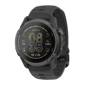
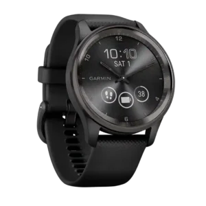
The user interface is much improved, easier, and more inviting, though a few Garmin quirks remain.
Pros: comfort, software smoothness
Cons: ECG functionality, LTE connectivity
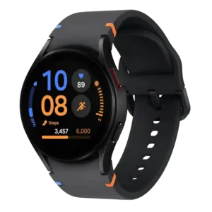
The user interface is generally clear and approachable, though Samsung's layout and ecosystem prompts can feel cluttered or clunky to some reviewers.
Pros: outdoor visibility, workout tracking variety
Cons: cross-platform compatibility, battery life
The user interface is viewed as clear and intuitive, aided by cleaner TicHealth organization and smooth Wear OS navigation.
Pros: durability, battery life
Cons: ECG functionality, voice assistant quality
The interface is generally intuitive, with reviewers praising the touchscreen, simple golf start flow, and easy feature-to-feature movement.
Pros: software smoothness, GPS accuracy
Cons: voice assistant quality, call handling
The user interface is generally easy and simple, though one detailed review saw the overall interface feeling basic.
Pros: fit, battery life
Cons: call handling, voice assistant quality
The user interface is generally clean, fluid, and straightforward, though some navigation choices depend heavily on swipes.
Pros: third-party app support, workout tracking variety
Cons: ECG functionality, LTE connectivity
The user interface is praised for simplicity and accessibility, but that strength is tempered by the laggy touchscreen and limited controls.
Pros: operating system experience, charging speed
Cons: blood oxygen tracking, third-party app support
The core user interface was praised as logical and easy to navigate, especially with the physical buttons.
Pros: wellness insights, workout tracking variety
Cons: contactless payments, onboard music storage
The user interface is generally improved, logical, and precise, though some reviewers still describe Garmin software as clunky or learning-curve heavy.
Pros: charging speed, workout tracking variety
Cons: voice assistant quality, LTE connectivity
The user interface is easy to understand and beginner-friendly, with reviewers describing it as snappy, clean, and easy to learn.
Pros: value for money, comfort
Cons: contactless payments, onboard music storage
The user interface is cleaner and easier to navigate than before, though Garmin's learning curve and rare menu quirks remain.
Pros: outdoor visibility, brightness
Cons: ECG functionality, LTE connectivity
The user interface earns praise for speed and Garmin-like logic, but reviewers who dislike complexity found the watch less beginner-friendly.
Pros: workout tracking variety, water resistance
Cons: ECG functionality, LTE connectivity
The user interface is generally approachable, smooth, and pleasant, with reviewer praise for simplicity and navigation despite some platform limitations.
Pros: pairing reliability, step counting accuracy
Cons: ECG functionality, voice assistant quality
The user interface is generally clear and intuitive, though its data-heavy and retro presentation may not appeal to casual users.
Pros: workout tracking variety, comfort
Cons: blood oxygen tracking, ECG functionality
The UI is easy to learn for some reviewers and seamless in places, but Xiaomi’s Wear OS skin also creates confusing or buggy behavior.
Pros: materials quality, Bluetooth connectivity
Cons: ECG functionality, reliability
The UI is generally clear, colorful, and optimized for the large square screen.
Pros: workout tracking variety, battery life
Cons: onboard music storage, LTE connectivity

The user interface is more spacious and readable, but some reviewers feel new menus and features add clutter.
Pros: charging speed, contactless payments
Cons: cross-platform compatibility, blood oxygen tracking
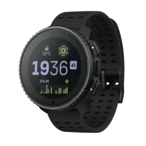
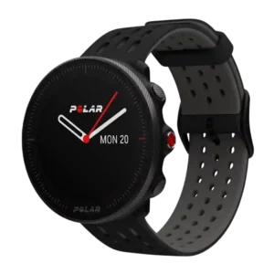
The user interface is usually considered simple and athlete-focused, but not as polished or feature-rich as some rivals.
Pros: battery life, software smoothness
Cons: contactless payments, LTE connectivity
The interface was generally understandable and organized, though hardware/software lag held it back.
Pros: battery life, materials quality
Cons: ECG functionality, contactless payments
The user interface was mostly intuitive after acclimation, but the mix of touch and physical controls could be confusing at first.
Pros: battery life, GPS accuracy
Cons: voice assistant quality, onboard music storage
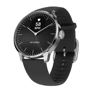
The user interface is clever for a hybrid watch, especially the moving hands and gauge-like displays, but it still takes adjustment.
Pros: activity auto-detection, display quality
Cons: ECG functionality, onboard music storage
The user interface is usually considered clear or easy, though it remains utilitarian rather than modern-smartwatch rich.
Pros: workout tracking variety, sleep tracking accuracy
Cons: blood oxygen tracking, voice assistant quality
The user interface is generally usable and sometimes praised as intuitive, though it can feel less refined than leading smartwatch ecosystems.
Pros: durability, pairing reliability
Cons: contactless payments, call handling